When you set out to create, the instinct is to make it your own. Whether it’s a piece of artwork or a podcast, you want to give it your own signature. The same is true for online courses. You want to create a unique course curriculum. You want to write and film the content your way. You even want to pick the colors, fonts, and the layouts that best reflect you or your business’s personality. On Teachable, you can do just that.
We pride ourselves for being one of the best online course delivery platforms. We’ve created a simple and intuitive experience to make it easy for students of all ages to navigate the course material. Now, we want to give you, the creator, an updated modern look and additional options to introduce your course with course design templates.
First impressions matter
Just like with any other product you buy, the best moment is when you open it. You get to look at everything the product offers and get excited about all the different things you can do with it. It’s no different with a course.
When a student enrolls in your course, the first page they land on is the course overview page. On this page, your students will be able to see the following key elements of the course they just paid for or enrolled in for free:
- Course Image
- Course curriculum
- Course progress
- Course author
Immediately, your students will see the full range of content you’ve put together. If you’ve enabled course compliance or have decided to drip out your content, they’d still see the curriculum sections to come even if they can’t immediately engage with the content. In addition, they’ll also get a sense how they’d progress through the course, a reminder of your expertise as the course author, and an image that reflects the course goal.
Here’s a breakdown of the course design templates we offer and how our creators have use them:
Colossal

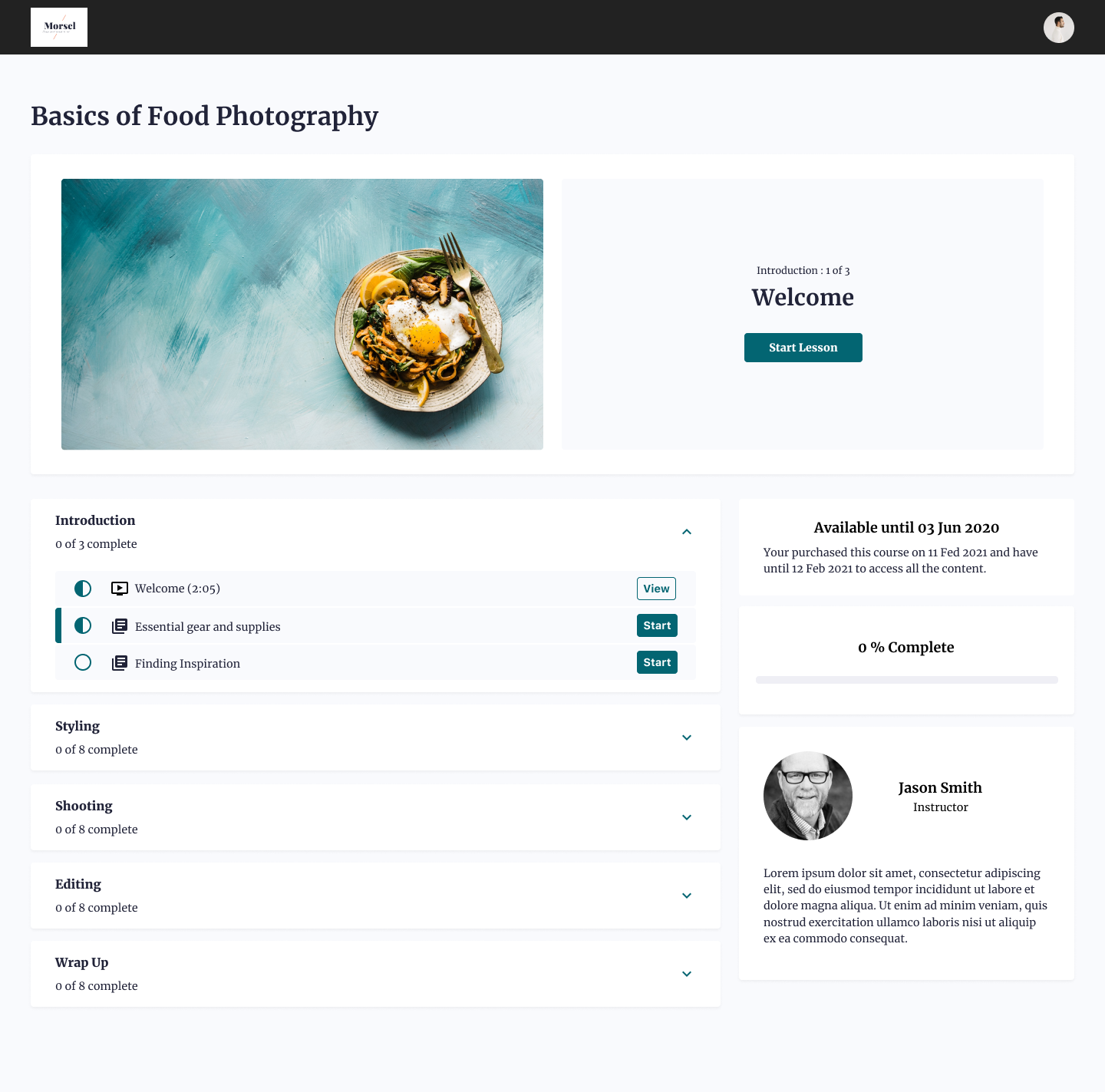
The Colossal design template gives you a modular course overview layout. Each of the key elements has its own module, laid out to give the focal point of where you student should begin the course or where they last left off.
The Colossal template is mostly used by creators who want to display all the information on the course overview page. It allows the student to see everything at one glance with clear direction on the top on which section they should go to next to progress through the course. This is also a particularly popular template for bundled courses. When using bundling, all included courses will display in a module below, introducing more navigation through the bundle as the student completes the curriculum of each course.
Simple

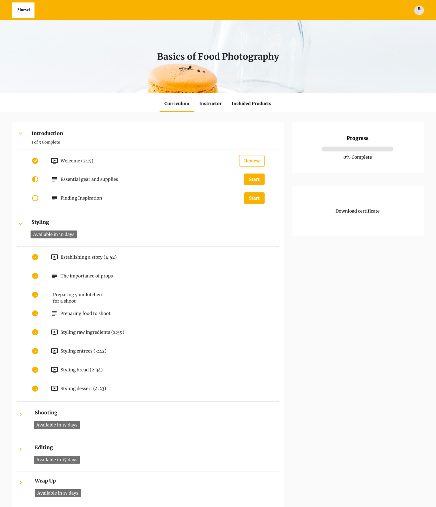
Instead of modules, the Simple template showcases the different elements in the form of tabs. With a large banner across the top, it gives creators a way to set the branding for course topics that are more visual and aesthetic.
The Simple template is mostly used by creators who have a lot of content in their curriculum. This template is ideal for creators who want the student to focus on the material they’ll need to go through and don’t want the other key elements that may distract. Plus, with the tabs, it gives you more real estate to provide a more detailed and thorough course author bio for the students to get to know you better.
Teachable Classic

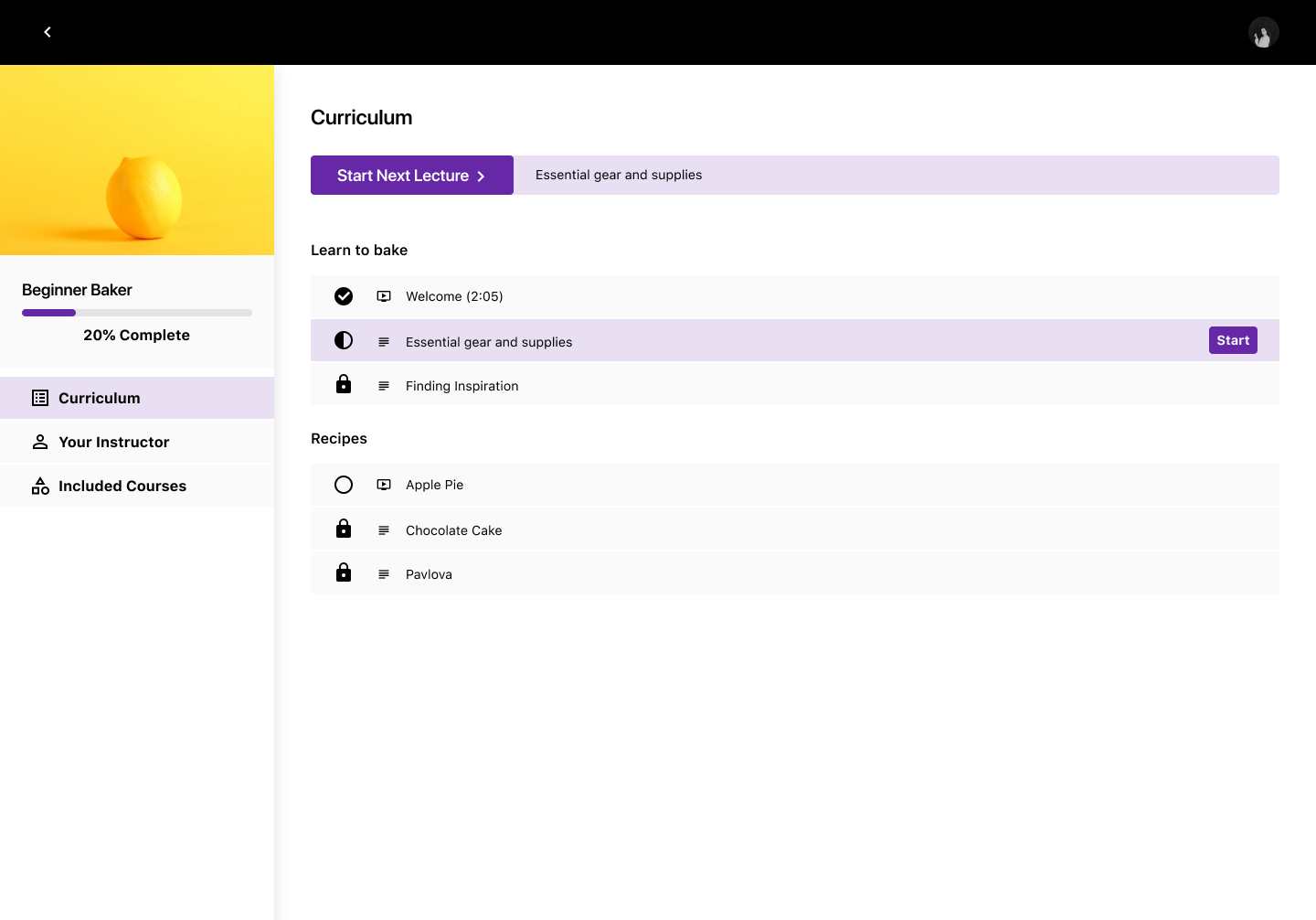
Our Teachable Classic template is our proven, default template. It has the same layout as the lesson player and is designed to get the student started on the curriculum. Similar to the Simple template, the student will find all the same key elements in tab forms but it will rest on the left of the screen.
The Classic template is mostly used by creators who have a short curriculum—typically a free or mini-course. Unlike the other two templates, you cannot collapse the course sections. So if you have a long curriculum, it might be overwhelming or tough for your students to sift through all of it.
Refresh and differentiate
Course update
After you’ve successfully created and launched your online course, it can bring you steady recurring revenue. But, you don’t want to redo the content if your course topic requires updates or evolves. Rather, simply go back and edit the content to provide updates.
For example, if you teach a course on setting up WordPress, you’d need to go back and edit it to include the changes and updates WordPress has made. Next time you make that update, think about refreshing your course design template, too. This will give your students the feeling that you’ve put additional effort into revamping the course, and might even re-engage students who have dropped off to come back and complete it.
Free, Mini, Flagship
For many of you, creating one course is not enough—you have too much knowledge to share. You might even use different types of courses, like free courses or mini courses, to nurture your students and prepare them for your biggest and most premium course.
Use the Teachable Classic for your free course, the Simple template for your mini course, and the Colossal template for your Flagship course. The visual difference not only helps your students differentiate each course product, but it also helps your brand each course according to their price point.
Join more than 150,000 creators who use Teachable to make a real impact and earn a real income.


.png)
.png)
.png)
