Oftentimes, a landing page sets the first impression a potential customer has of your business. The best landing pages inspire visitors to take action. It tells your brand's story, nurtures new customers, and drives conversions – landing pages have 160% higher conversion rates compared to other types of sign-up forms.
To maximize your chances of getting new leads and increasing your sales, you want to make sure you invest your time and effort in building a landing page with great design for your business. Improving your landing page design can lower your paid ad spend because each new visitor who lands on your improved page through ads will be more willing to stick around and convert into a new lead.
Sounds pretty good, right? Now that you know the benefits of a well-designed landing page, let's talk about how to create high-converting landing pages for your business.
{{salespage-component="/blog-shortcodes/blog-popup"}}
What is a landing page?
A landing page definition is pretty straightforward — it's a single page with a specific target of getting visitors to complete an action. The name "landing page" comes from the idea that people will land on it from somewhere else, usually digital marketing, such as an ad campaign.
Your landing page design needs to speak to your target audience and drive them to your call-to-action (CTA). A CTA can be for a visitor to sign up for your newsletter, download an ebook, enroll in your online course, buy a product, or something else. Everything on a landing page, from copy and images to layout, should support that one goal.
There are different types of landing pages, and each has a slightly different purpose:
- Lead generation page: This type of landing page is designed to capture leads's information like name, email, industry and more by offering a lead magnet (ebook, trend report, etc.) in return.
- Click-through page: This landing page is the page that the visitor sees before they're asked to make a purchase, and it's goal is to entice the visitor with an irresistable offer such as a free trial of a product.
- Squeeze page: A squeeze page is the most effective landing page, and its sole purpose is to capture the user's email address.
- Splash page: It's a page that precedes the main page of your website, with the goal of promoting a new offer, showing a disclaimer, or asking the user to verify their information.
- Sales page: These landing pages are often long and have a very clear CTA at the end, which is often a link to an expensive product like an online course. These pages are long because they are focused on selling a high-value product to those who land on the page.
Note: At Teachable, you may sometimes hear us call a landing page a “sales page”.
Landing page vs. homepage
A landing page is different from a homepage. A homepage is designed to appeal to multiple audiences and convey information to anyone interested in your overall brand.
For example, Monday.com is a popular work management tool. If you look at its homepage, it speaks to all of its audiences and products from project management to CRM.
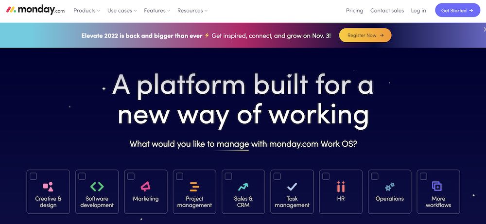
However, it also has Google Ads running for its different verticals. If you search for a project management tool in Google, you might see a Monday.com ad. It takes you to a project management-specific landing page.
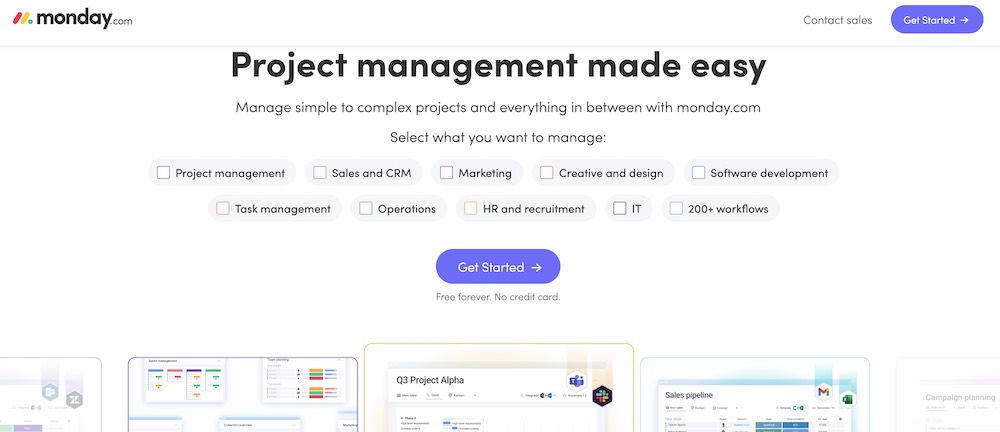
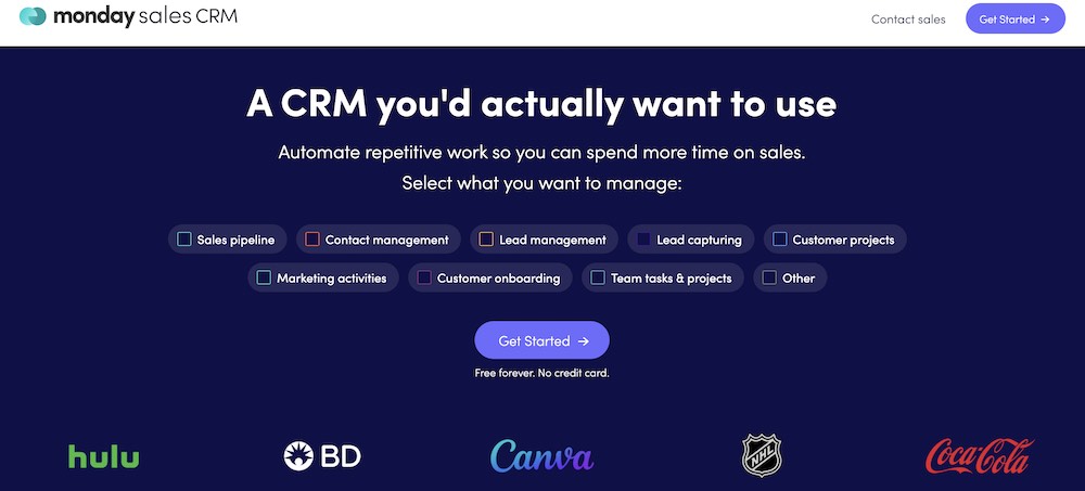
Similarly, if you were to search for CRMs, you might see a CRM landing page. With this, you can easily visualize how a homepage differs from a landing page.
How to write a landing page
To create a landing page, you first need to craft your copy. These tips can help you write a landing page that communicates your brand story, what your product or service does, and why visitors should take action.
1. Get clear on your value proposition
These four questions explain what potential customers get from you and why they can’t live without your offer, while also creating a sense of urgency.
- What is the offer?
- What are the benefits?
- Why does your audience need your offer now?
- How do they get the offer?
When you are first writing a landing page, answering these questions can help you form your outline.
Simply put, these questions are the beginning steps to building your page’s unique selling proposition. Also known as the value proposition, it is a statement that clearly identifies why a customer buys your product or service.
2. Nail your audiences's pain points
When you build landing page, consider your audience and your competition. Your landing page copy needs to be tailored to your audience.
- What are they getting out of your product?
- How are you solving their painful problems?
Knowing their hopes, ambitions, and goals will make writing engaging copy much easier.
Try visiting online communities, forums, or websites where your audience hangs out. You’ll discover their desires, problems, and what they enjoy. You can use this information to help tailor your copy to their preferences.
In addition, do competitor research. Make a list of at least three competitors and audit their landing pages. How do they position themselves? Where do you beat your competitors?
3. Include power words
The goal of your landing page is to get your audience to convert. The copy of your page needs to be centered around this goal and reinforced each time you write a headline, a subhead, and a call-to-action.
Each of these sections communicates your unique value proposition: why people will buy from you and not your competition.
Your text needs to be captivating, persuasive, and above all else, clear. You don’t want your audience to be confused about what you are telling them or what they are getting from being on your page.
One way to do this is by using “power words”. These specific words evoke emotion and establish a connection with visitors, which can help increase conversions.
Words that work
There are many power words that you can use, but these are three of the most common.
- You – When you use the word “you”, it feels like your product fulfills their goals, desires, dreams, and interests.
- Because – Because is an indicator of an upcoming explanation of the reason why. Hearing or reading the word “because” cues the brain’s gatekeeper to let the message pass into the subconscious.
- Imagine – The word “imagine” helps the audience envision the outcome of a purchase, not the act of purchasing, which helps lower their purchasing resistance. By feeling like they already have something, buyers will want to keep it, aka make the actual purchase to keep those desires fulfilled.
Use these three words to connect with your audience and entice them to buy your product.
If you are unsure of what other power words to use, get some inspiration from your existing customers. Is there a word or phrase they keep using in emails, on social media, or on online forums when talking about your product? If so, try out that phrase.
Talk to a friend, peer, or audience member to see if the message you’re envisioning translates correctly to them. You can even A/B test to see if one performs better than the other.
What are the key components of a landing page?
Now that you have a rough draft of your landing page copy, you’ll need to organize it into sections or components. There are six main components that are crucial to landing page optimization.
- Headline
- Subheading
- Images
- Benefits
- Social proof
- Call-to-action
These six components need to work in cohesion together to create a high-converting landing page.
1. Headline
Your headline is the first thing a viewer will see when they come to your page. It needs to be clear and concise, confirm your offer, and include messaging that reflects the audience's entrance point.
Effective headlines have these three things:
- Clarity: The best headlines are clear, straight to the point, and easy to understand the moment people read them.
- A hook: Effective headlines capture readers' attention, draw them in, and make them curious to find out more.
- Empathy: Great headlines empathize with people's pain points and offer a solution or a transformation.
If you keep these three elements in mind when drafting your landing page headlines, chances are that you'll be able to craft just the right headline (or a few) that speak to your target audience and increase your conversions.
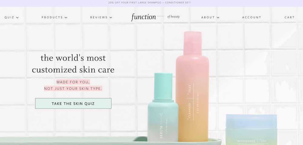
For example, Function of Beauty has a landing page for its line of custom skincare products. The headline is "the world's most customized skin care". It highlights that it is made for you, not just a skin type and it also uses a personalized quiz CTA to reinforce the custom skincare value proposition.
2. Subhead
Your subhead is a more in-depth description of your headline. It usually appears just below your headline, and it is in a smaller font. Use the subhead to be persuasive and explain your offer in greater detail.
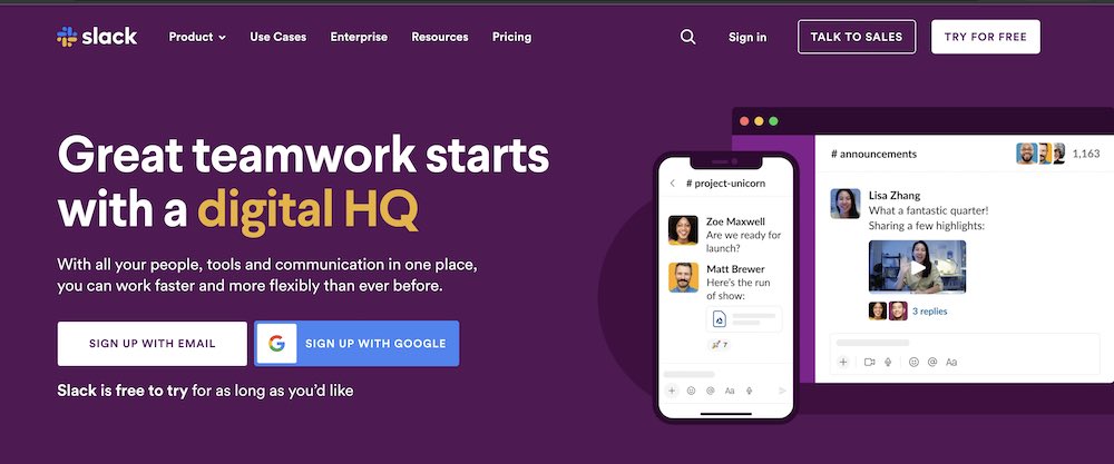
Let's look at Slack as an example. It clearly highlights the value proposition — work faster and more flexibly — when you use Slack.
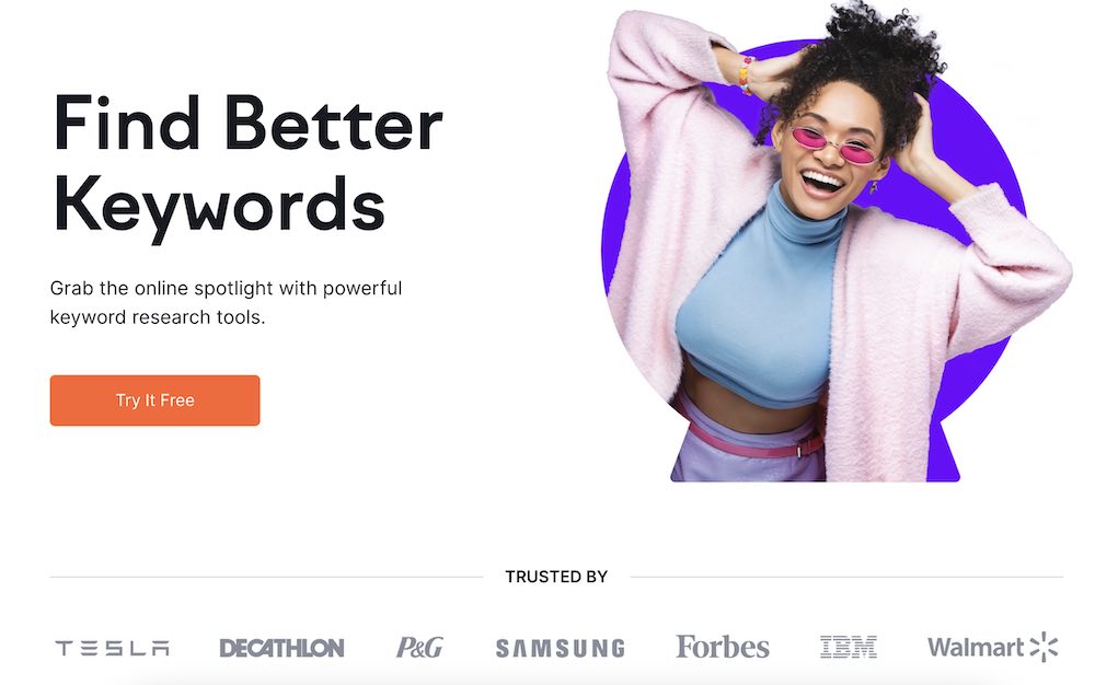
3. Compelling images
Include a striking image of your product or a photograph that relates to your message. It is even better if you can show your product or service in action or include a video — that alone can increase conversion rates by 86%.
According to The Next Web, our brains process visuals 60,000 times faster than text. Captivating images makes your page look better and gives your audience a better page experience. They also provide visual cues to entice your audience to remain on your page and learn more about your offer.
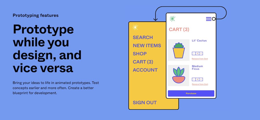
As a design tool, Figma needs to have well-designed visuals. This landing page for its prototype features includes examples of what you can create using Figma. It makes it easy to visualize using it for your design projects.
4. Benefits
You need to sell your audience first on why they need your product, and how it solves their problem.
The benefit statement section is where you can address the pain points you’ve found for your audience. Use a bulleted list to explain how your offer directly solves their pain problems. Make sure to focus on the benefits of your product, not solely on the features.
Adding in all of the features at this point may confuse or complicate their decision, which can lead to them not buying at all.
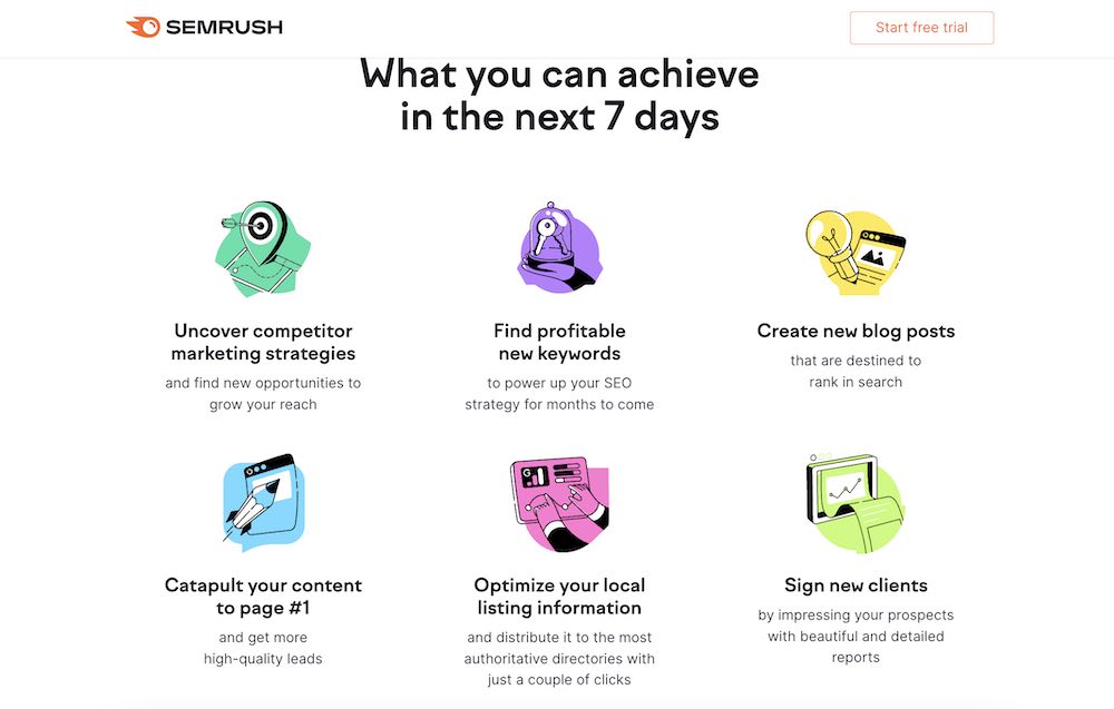
Semrush’s landing page for its free trial highlights six benefits of using the marketing tool. It focuses on what you can achieve within seven days of trying its product, including signing new clients and learning about your competitors.
5. Social proof
Including social proof no your landing pages can increase the conversion rates by 5%. Social proof shows your audience that others have taken your course or used your products and would recommend it. It is a necessity to design landing pages that convert. The more a visitor sees that others like and benefit from using your product, the more likely they are to convert.
You can leverage different types of social proof, including testimonials, reviews, and press features.
Usually, social proof will appear many times on a landing page, primarily right after the above-the-fold section. Semrush is a great social proof example. You can see they include top companies that use the product, leveraging their brand equity and creating credibility.
6. Call-to-action
Your call-to-action is the most important element of your landing page – that's why you have a landing page. You want someone to sign up for your offer. What it looks like, how it reads, and where it is placed will impact your conversion rate.
Remember, you want to have just one CTA – multiple CTA's reduce the conversion by 226%. A single strong CTA makes it clear to potential customers what you want them to do. Plus, you'll increase your chance of conversion if you are driving them to one goal versus dividing their attention between more than one.
Be brief but clear. Avoid the "submit" and "send" CTA buttons because they are vague. You need to describe exactly what you want from your customers or the next steps—what will happen when they click.
Another element you can capture in your CTA is urgency. For example, this landing page for Nom Nom highlights a special offer to get 50% off and free shipping.

CTA landing page design tips
- Enclose CTA text in a box. This makes it look like a button, and people want to click buttons.
- When the mouse hovers over the button, have it change colors or shade. It entices people to click and shows them that it is clickable.
- Color doesn’t matter. Contrast matters. Your CTA button should stand out from everything else on the page. First, find the main color of your site, then look at the color that is directly opposite it on the color wheel. That is the best complementary color for you to use for your CTA. For example, if your page background is blue, use an orange CTA to stand out from the rest of the site.
- Size is important. Make the button larger than the other text on the page. You don’t want your ultimate goal to get lost.
- Include white space around your button so it clearly stands out from everything else on the page.
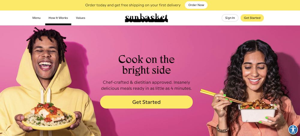
Sun Basket has a CTA button that pops off the page. The bright yellow stands out from the background and it has enough white space around it to draw your attention.
Bonus page: Thank You
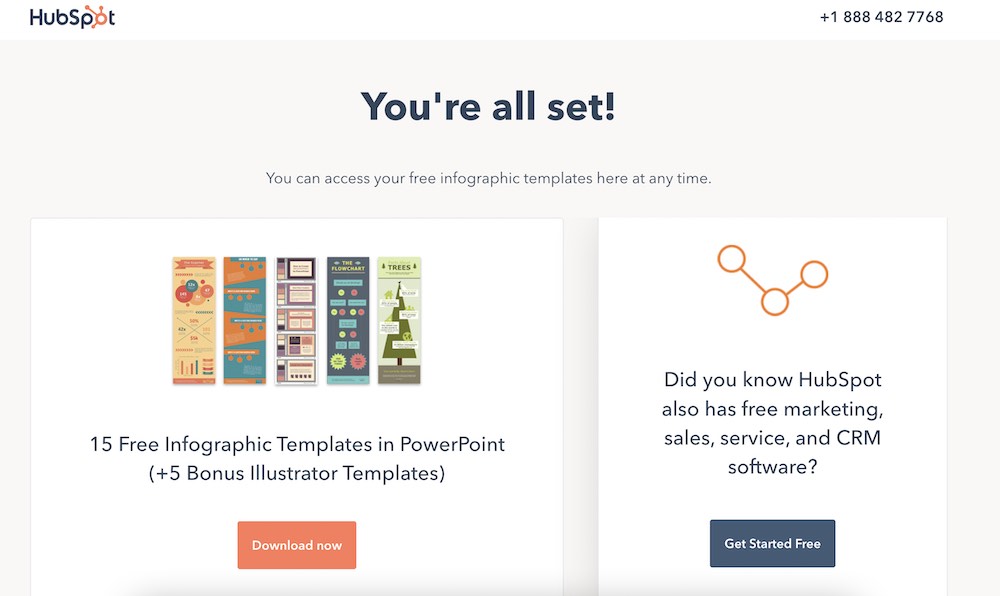
Once your audience completes your CTA, you have one more page to keep their attention and inspire further conversion: the Thank You page.
The Thank You page is the perfect place to introduce your audience to other products you have since you’ve already captured their attention. This could be another CTA asking them to share the content they just signed up for, subscribe to your blog, sign up for your newsletter, attend a live training webinar or even give them a bonus piece of content.
For example, when you download a template from one of Hubspot’s resource landing pages, the Thank You or confirmation page looks like the below. It includes a CTA to learn more about Hubspot software.
How to create a landing page
Landing page builders
You don’t need to be a web designer or developer to create high-converting landing pages. In fact, there are many do-it-yourself builders, offering an easy user interface plus hundreds of landing page templates to choose from. You can plug these into your existing website and maintain the same user experience site-wide.
Here are a few user-friendly platforms to design a landing page:
If you sign up for Teachable, you can create a landing page for your first course in as little as 10 minutes.
5 principles for landing page design
Next, we’ll discuss some simple landing page design elements (color, typography, images) to think about when you’re creating your page to make it even better.
Whichever path you choose, there are still a few things that you need to think about when building your landing page: color, fonts, and images.
1. Choose meaningful colors that contrast
It’s the great marketer debate: Does color affect conversion in terms of landing page design?
To keep it as simple, we’re going to discuss a few elements to consider when thinking about colors for your landing page design (and brand).
Every color has psychological implications associated with it. When choosing your landing page color palette, consider what characteristics you want your brand to portray.
Colors have meaning
Pick colors that are associated with the characteristics you want to exude. If you want to portray luxury and trust, blue and black would be good options. If you want to hint at optimism and health, use yellow and green.
Complementary colors
Contrast is important. When two complementary colors are placed next to each other, their contrast is the strongest, and actually makes the colors appear brighter.
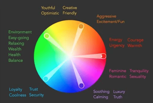
When choosing the palette for your site, make sure to include a color complementary to your page’s main color.
Here are some sites for palette inspiration:
Make sure the colors that you pick are readable. You don’t want a green background with blue text. A helpful hint is to use a light background with dark text.
2. Pick typography
If you’re designing your own landing page from scratch, you have to pick your own fonts. The best practice is to stick with commonly used Google web fonts like:
- Georgia
- Verdana
- Geneva
- Arial
- Helvetica
- Tahoma
- Trebuchet MS
- Monospace
- Lucida Console
- Monaco
Using these fonts ensures that the majority of browsers and operating systems render your text correctly. Plus, it’s much easier when sending newsletters and dealing with different email service providers.
When choosing fonts, stick to one font to reduce the clutter on your landing page. Each of the fonts above has bold and italic styles, which are simple ways to differentiate text. Also, make sure you have the proper licenses to use these fonts for your business.
3. Use the proper font sizes
Another way to differentiate text is with size. A study by Wichita State found that body text is best at 12pt because it’s the easiest to read in the least amount of time. If your audience is older, bumping up the point size to 14 may make it easier on the eyes. Headlines look best at 17 to 25pt.
In that same Wichita State study, it was discovered that any font, larger or smaller than 12pt, decreases readability. If you want someone to spend time reading your copy, try enlarging the size in the testimonial section or reducing the size for the money-back guarantee statement.
The last size factor to consider is line spacing. Make sure there is enough space between each line to give the text room to breathe and be read easily.
4. Select clear images
Earlier, we explained the importance of having an image of your product. Now we’ll go into more detail on how to choose an image and its importance to landing page design.
Most importantly, you want the image to add to your landing page, not detract from your message. Include a clear, high-quality image that is not busy.
Think about how the text will look on top of the image. If your image has a lot going on, consider darkening it up with Photoshop. This way, the text will be easier to read.
A quick hack is to add a dark rectangle over the photo and reduce the opacity. The image should be dark enough for the text to be readable.
5. Check all devices
Once you’ve created a landing page, be sure to double check it on mobile devices, which is often where traffic comes from.
With these landing page design tips, you’ll be well on your way to understanding how to convert customers. Test out a few different landing page designs first and A/B test each to see how it performs. Your first version can always be refined after you have some data to understand how users interact with your page. If you are creating a landing page for a course, you can get started easily with Teachable’s sales page template.
Landing page examples
The best way to understand the secret to building successful landing pages is to see all these practical tips we discussed today brought to life. So, let's take a look at a few powerful landing page examples:
Shopify
This is an excellent example of a click-through landing page.
A strong headline, a quick subhead explaining the most important thing, and a very clear CTA to type your email address and get a free trial of the software.
Lower down the page, it has social proof and an FAQ section addressing the most important questions and concerns people might have, which all add to a very simple yet effective landing page design.

Ali Abdaal
Ali Abdaal's landing page for his bestselling book Feel Good Productivity takes the landing page design to the next level. The landing page design is simple, yet effective and super interacting with all the visual element playfully moving through the screen as you scroll down, without impacting the load speed or responsiveness.
This landing page has a strong headline, video explainer, testimonials from industry experts, and very clear CTA's inviting you to buy the book at the very top and bottom of the landing page.

Pat Flynn
Pat Flynn's online course landing page is very modern and simple, and it captures the visitor's attention immediately. The headline and subhead tell you everything you need to know about the course, and the video explainer is engaging and enticing. There is a very clear CTA, testimonials, and even an FAQ addressing any questions people might have about joining his online course.
Jenna Kutcher
It's worth putting in the effort in your landing pages for free training, and Jenna Kutcher is a great example. Her free email-building training landing page is informative and engaging and has the best personalized CTA right at the beginning of the page. While there is no explainer video, there are visual assets like videos and images of Jenna, which make the design high-quality and professional.

Mel Robbins
Another phenomenal free-training landing page example is for Mel Robbins's 2-part video training. Right at the very top of the landing page, you see the benefits you'll gain from taking part in this training. Next to it, there is a video explainer, that's informative and engaging. The CTA is clear and simple and takes less than a few seconds of people's time.

Product landing page
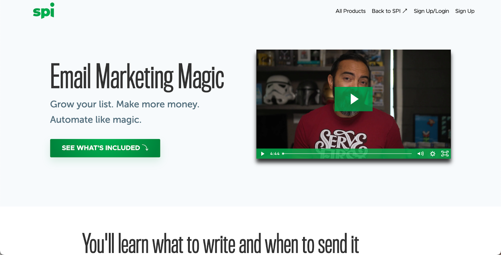
This landing page (below) was quite long. The top “above-the-fold” section offers an easy way for customers to sign up (the CTA), alongside descriptions of what exactly is included in the online course. Further down the page are video testimonials (social proof), an overview of the modules, and buttons to reinforce the CTA.

Lemme
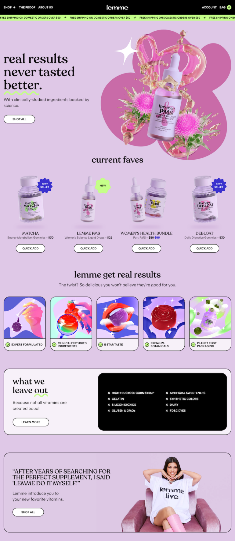
As you’ll see on Kourtney Kardashian Barker’s new online shop of herbal vitamins, this landing page has bright, eye-catching images and a few different CTAs—the dominant invitation being to “Shop All”. As you navigate to individual products, you’ll find social proof, more easy-to-digest information about ingredients, and more.
Real estate landing page
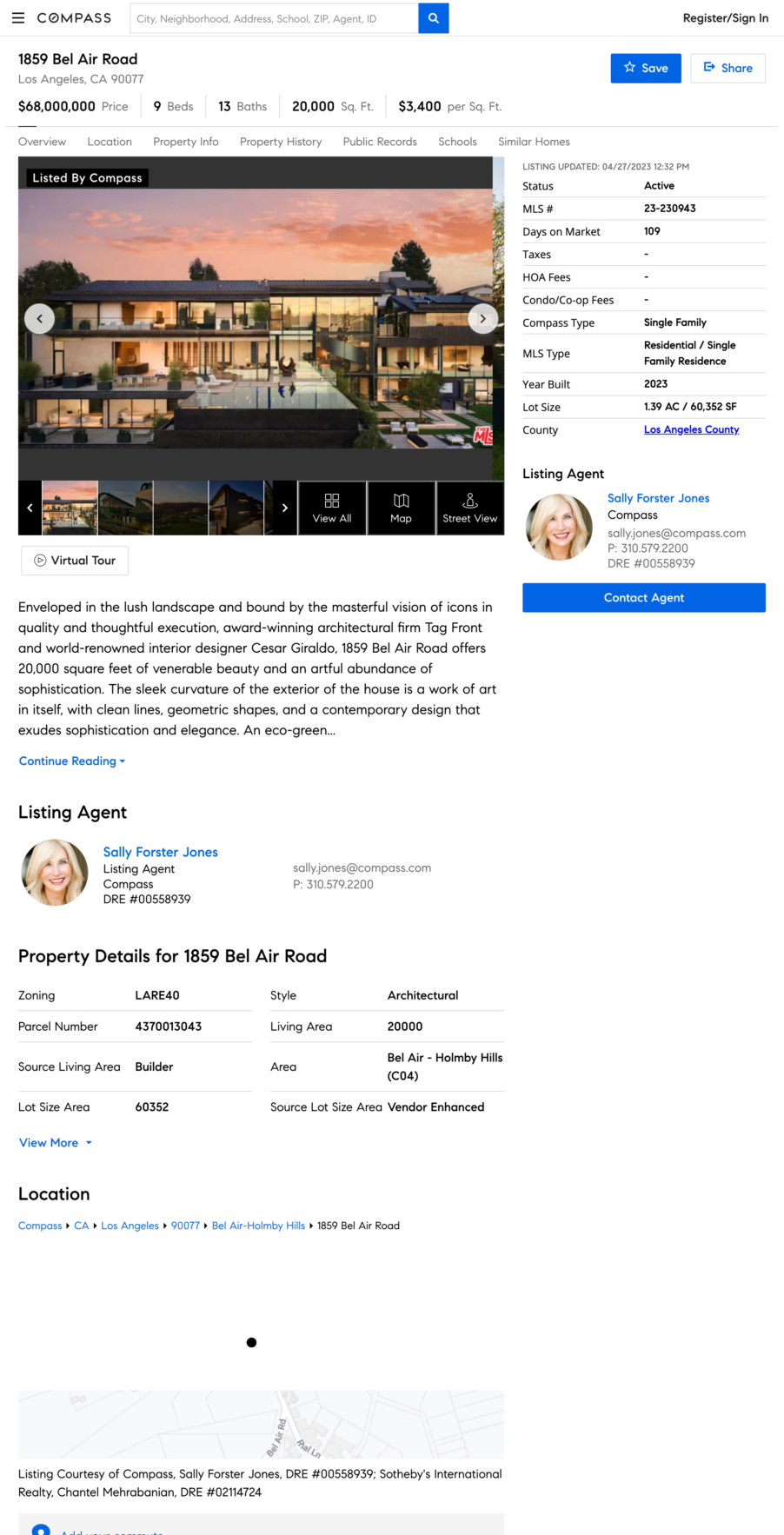
When it comes to real estate, the images are often front and center. You’ll notice this example doesn’t even have a heading or subheading. The benefits are the features of the home, which can be found in the descriptive paragraph and the charts above the CTA button.
Event landing page
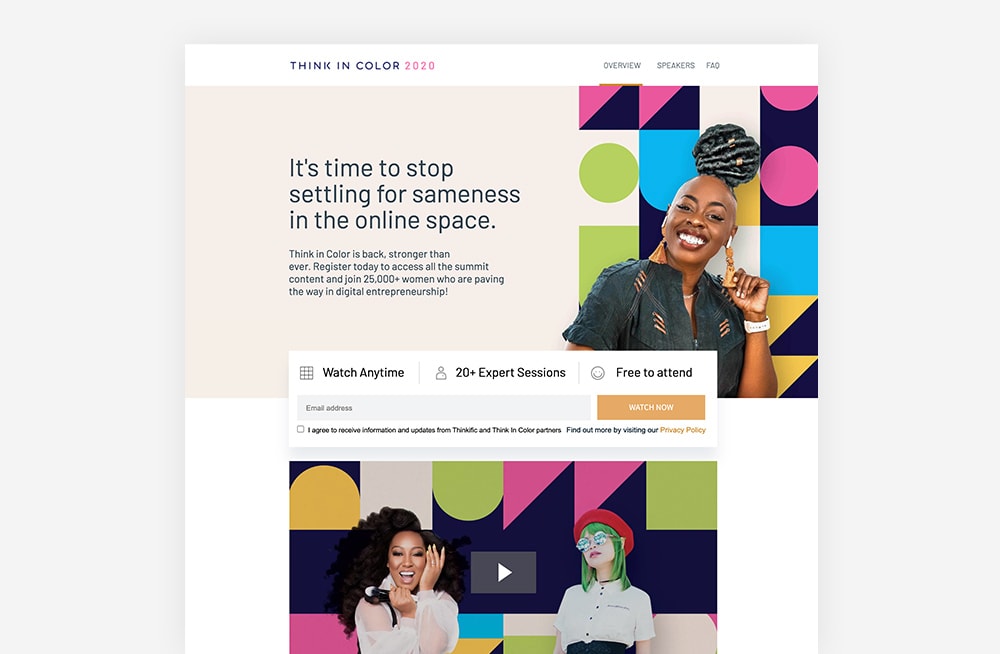
Here is an example Unbounce recognizes as effective because of how it speaks to a specific target audience (women entrepreneurs in the digital space). Meanwhile the design treatment above the CTA bar highlights incentives to sign up: watch anytime, many experts featured, and free.
Lead generation landing page
Popular website builder Wix uses a pop-up to capture visitor information, while all of the benefits remain in the background on the landing page. The CTA button clearly indicates that there is no harm, risk, or commitment to trying: “Start for free.”

Webinar landing page
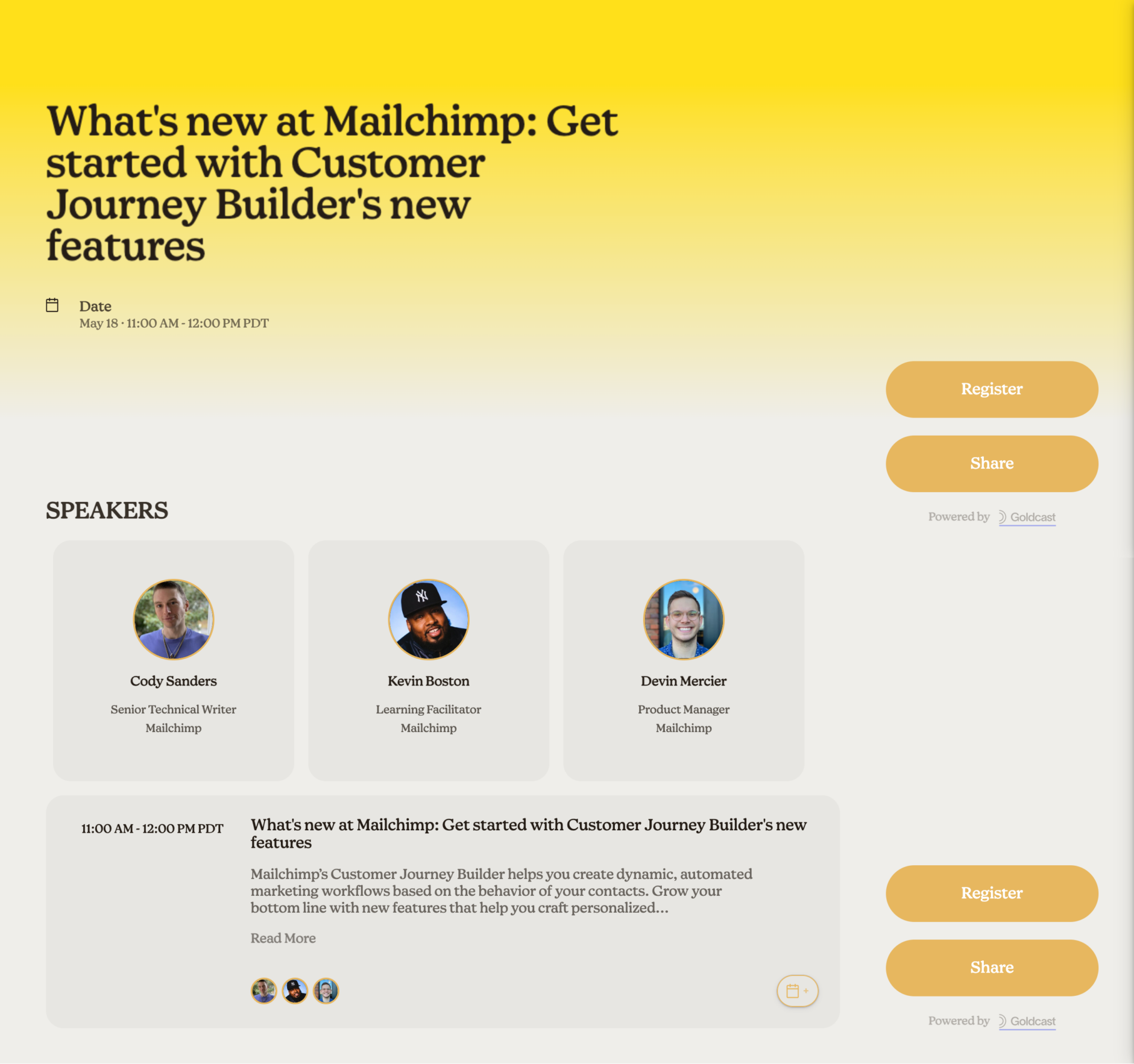
While this webinar, hosted by Mailchimp, doesn’t have a main image (just headshots of the speakers), the branding is consistent with the email and marketing platform. From the headline (and lack of subheading), it’s clear that the intended audience is MailChimp users. Meanwhile, the landing page offers two actions: to sign up or spread the word.
Coming soon landing page
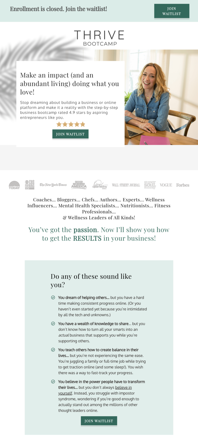
Whether you’re about to launch a course or enrollment has already closed, you can still track interest and capture site visitors’ information. Here’s an example of Kris Carr’s membership container, Thrive Bootcamp.
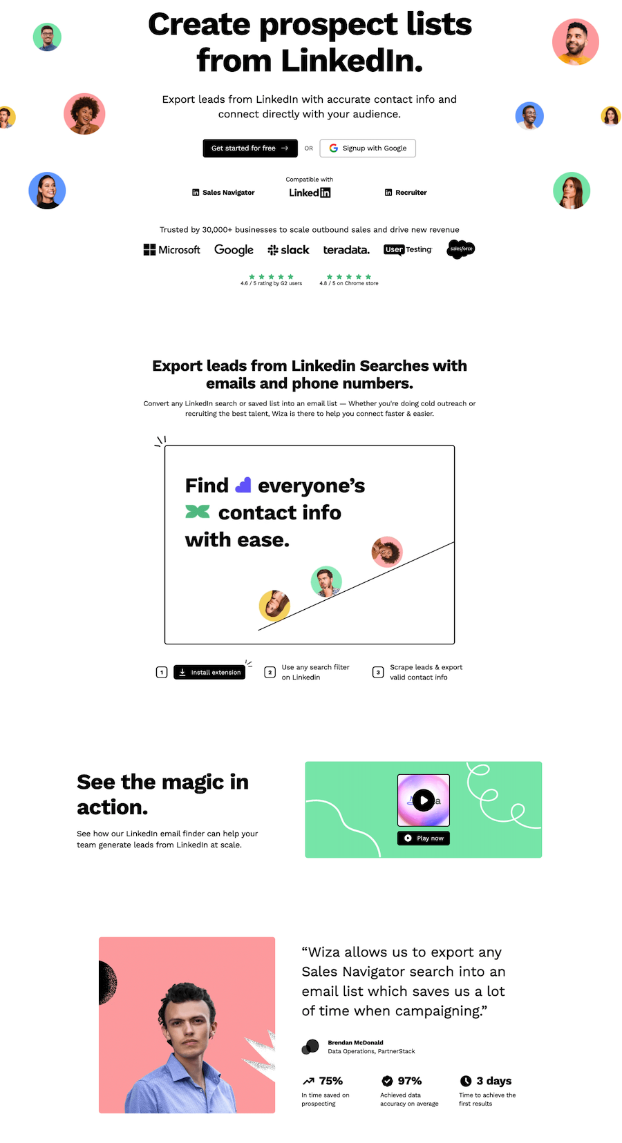
SaaS landing page
SaaS stands for “software as a service” and allows customers to access applications over the internet through cloud-based delivery. This landing page example features the six key components in a fluid (and effective) way.
Measuring and optimizing performance
Once your landing page is live, your landing page analytics will be your best friend. Through analytics, you can learn what works and what doesn't, and you can get a better look at your audience's behavior. By analyzing your analytics, you'll be able to improve and reap better results for your business.
Here are some of the most important metrics you want to pay attention to when it comes to analytics and optimizing landing pages:
- Page visits/views: This metric tells you how many people visited your landing page, and it's a good indication of how well your marketing is working – if you have lots of visits and views, it means that your marketing efforts to drive traffic are working. And if not, it's a sign you might to review your strategy.
- Traffic sources: This metric allows you to inspect where people are coming from, and it's a good way to understand which marketing channels are worth your time and which might need a new approach.
- Bounce rate: Bounce rate tells you how quickly after someone lands on your website they leave. A higher bounce rate means that people are not getting what they expected when they clicked the link to visit your landing page, or that they loose interest.
- Submission rate: This metric tells you how many people filled the submission form, and it's an important metric that tells you how enticing your offer is.
- Form abandonment: This metric shows how many people started filling out the submission form, but chose to leave mid-way. It could mean that your submission form needs some adjustment to make it shorter or maybe you need a stronger offer.
- Heat mapping: This metric is a bit more advanced, and it allows you to see which parts of your landing page got the most action. Tools like Hotjar allow you to see which elements of your landing page design work, where people lose interest, or which parts are not interesting to them.
Biggest landing page mistakes people make
The two most common landing page challenges businesses face are high bounce rates and low conversion rates. If you're also facing these challenges, don't be alarmed – we have landing page solutions for every challenge you might face.
High bounce rate
On average, landing pages have a bounce rate of between 70-90%. Obviously, you want to keep your bounce rate at the lower side of things because if you have a high bounce rate, it means that something on your landing page is not working for people. It could be a marketing problem – you're attracting the wrong people, so they bounce quickly. Or, it could be an indication that you need to improve your landing page design.
So, consider tackling the issue at hand in small steps. First, review your marketing efforts and see if your social media promos, and paid advertisement is driving the right people to your landing page. If you find that you are targeting the right people, then it's time to take a look at your landing page design.
Consider tweaking small elements like headlines and your visuals (include visuals if you have none), and review your CTA's – are they clear? Is there more than one? Make sure your copy is easy to read and digest. Utilize the white space and simplify your landing page design.
Low conversion rate
The average landing page conversion rate across all industries is 4.3%. A good conversion rate is anything above 10%. If you notice your conversion rate to be low, don't get discouraged – there are plenty of things you can do to change that.
One thing that could compromise your conversion rates is your CTA. So, the first thing you want to do is review your CTA's – is there one clear CTA or multiple ones? Is the CTA personalized or general? Does your CTA stand out, or does it get lost amongst other design elements on your landing page?
Once you review your CTAs and make adjustments where needed, you should see an increase in your conversion rates. If not, then consider looking into your submission form, especially if you notice high form abandonment rate. Remember, the more information you ask in the sign up form, the less likely people are to sign up. Maybe it's worth simplifying your submission form to minimize the obstacle.
Alternatively, you might need to reconsider your offer. Maybe it's not clear enough, or maybe you need to find a different angle to convince people why they should sign up for your offer, and how much value they'll get from it if they do sign up.
Design your landing page with Teachable
Ready to boost your business with high-converting landing pages? With Teachable, you can easily create pages for your learning products. Sign up for a free Teachable account today and get access to powerful tools and resources to help you design pages that drive sales and capture leads. Start now!
FAQs
What’s the difference between a landing page vs. website?
A landing page is different from a homepage. A homepage is designed to appeal to multiple audiences and convey information to anyone interested in your overall brand. A landing page, on the other hand, is defined as a single page with a specific target—getting visitors to complete an action. The name “landing page” comes from the idea that people will land on it from somewhere else, usually a digital ad or another marketing campaign.
Your landing page design needs to speak to your target audience and drive them to your call-to-action (CTA). Everything on a landing page from copy and images to layout should support that one goal.
What should a landing page include?
There are six main components that make a landing page successful. These six components need to work in cohesion together to create a high-converting landing page:
- Headline: the first thing a viewer will see when they come to your page; should be clear and concise, confirm your offer, and include messaging that reflects the audience’s entrance point
- Subhead: a more in-depth description of your headline
- Images: striking graphics of your product or photographs that relates to your message
- Benefits: why audience needs your product, and how it solves their problem(s)
- Social proof: shows your audience that others have taken your course or used your products and would recommend it; could be testimonials, reviews, or press features
- Call-to-action: the reason you have the landing page/action you want visitor to take
What should not be on a landing page?
The elements of a landing page, including copy and graphics, should be intentional and specific to the goal (CTA) or offer. Your text needs to be captivating, persuasive, and above all else, clear. You don’t want your audience to be confused about what you are telling them or what they are getting from being on your page.


Join more than 150,000 creators who use Teachable to make a real impact and earn a real income.
.png)
.png)