Here at Teachable, we’ve seen a lot of call-to-action examples, so we know a good one when we see one. You can have the most well-thought-out course content and a beautiful presentation, but without compelling calls to action (CTAs) consistent across your marketing campaigns and channels, all your effort runs the risk of not gaining any traction. To support your small business, we’ve created some helpful copywriting tips, plus rounded up some of the most effective CTAs, to keep your audience engaged and your click-through rates high.
What is a call to action (CTA)?
According to Bryan Eisenberg and Jeffrey Eisenberg, authors of Call to Action: Secret Formulas to Improve Online Results (2006), the call to action definition is “a hyperlink that moves your visitor through your sales process.”
This word or phrase tells your target audience what you want them to do (or, if you’re really strategic, what they want or need) and inspires them to act—perhaps by buying digital products, scheduling an appointment, or signing up for a course.
Often, this kind of call for action is represented on a CTA button, which adds a visual emphasis to the hyperlinked text, draws attention, and makes it more clickable.
How to write effective CTAs to increase conversion rates
It’s important to know where you want to go—or rather, where you want your audience to go—so you can show them how to get there. What is the desired action you would like your audience to take when they encounter your:
- Social media post?
- Newsletter?
- Pop-up box?
- Website homepage?
- Specific landing page?
- Product page?
- Blog posts?
It might seem pretty basic, but start from where you’d like them to go and work your way backwards. To do this, it’s important to consider your marketing funnel. Rather than pointing them in many different directions, what is the ultimate action you want them to take? From there, you can start to funnel them in. Consider this general marketing funnel example: social media > lead magnet > newsletter > website or landing page
Calls to action can be found on each of these digital assets. While some CTAs might be the same or very similar, more often than not CTAs will differ depending on where they live in your marketing funnel. For instance, with this funnel example, your social media CTA would direct your audience to your lead magnet, perhaps a newsletter sign-up or pop-up, while your newsletter CTAs would direct your audience to your website to sign up for a course or purchase digital products.
Meanwhile, there can be many different CTAs throughout your website, pointing site visitors to different sections and pages. You can also monetize a blog by embedding different CTAs throughout your posts. On a sales landing page design, on the other hand, it’s a good strategy to have the same CTA repeating to close the deal, or reinforce the action you want the visitor to take.

The three essential ingredients for an effective CTA are: value proposition, urgency, and clarity. Another way to look at these three elements is what, when, and how:
- (WHAT) Value proposition: what are you offering, and does your audience care about it?
- (WHEN) Urgency: why should they click on it now (rather than later, when they are likely to forget about it)?
- (HOW) Clarity: how is this offer delivered? What exactly will they get when they click on CTA?
Tips for writing compelling CTAs
Tip #1: Keep it simple
Be short and sweet. You don’t have to have all of the elements mentioned above in your CTA. In fact, the more concise you can keep your copy, the better. A lot of the information can be inferred from your supporting text, for instance in your header and descriptions. The more you can say in fewer words, the better.
Tip #2: Be (pro)active
Active verbs are ideal because the action they’re prompting is very clear. If it’s not clear where a CTA button or link is taking you, visitors are less likely to click on it. Meanwhile, a good CTA will anticipate your audience’s wants or needs. For this reason, many marketers suggest writing in the first person (“Sign me up” rather than “Sign up”). To take it even further, try to weave in power words that elicit an emotional or psychological response whenever possible.
Tip #3: Create a sense of urgency
An obvious way to do this is adding “now” to the end of a CTA (i.e. “Sign up now”). Depending on where your CTA will live, however, you might also add in an expiration date or limited availability verbiage. For instance: “Use code XXXX for 50% off thru Thursday,” “Claim your rewards before they expire,” etc.

Tip #4: Add a personal touch
When copywriting your CTAs, keep your personal branding in mind. Consider what your typical tone of voice is. How do you talk to your audience? How do you want them to feel when they engage with your brand? Maybe you’re big on puns or word play, maybe you like to highlight your values and customer service, and maybe you’re somewhere in between. Whatever your brand voice is, CTAs are an extension of it and an opportunity to write creatively (and persuasively).
Tip #5: Give a choice
Two is better than one: having two CTAs can keep your audience engaged longer by offering two different experiences. A common example of this is with a subscription service or app. Visitors can choose to pay for enhanced features or use the free version. If you have the tech resources, you might also consider testing out different CTAs via A/B testing to see which resonate with your target audience more.
Tip #6: Make a list
As a creative writing exercise, list out as many potential CTAs as you can. You can even time yourself (to add urgency!). Research shows that your first headline is never the best option, but if you make a list of potential headlines, you’re bound to generate more compelling ones. The same can be true with CTAs. We’ve gotten you started with 41 tried-and-true call to action examples. See how many more you can come up with.
Social media call to action examples
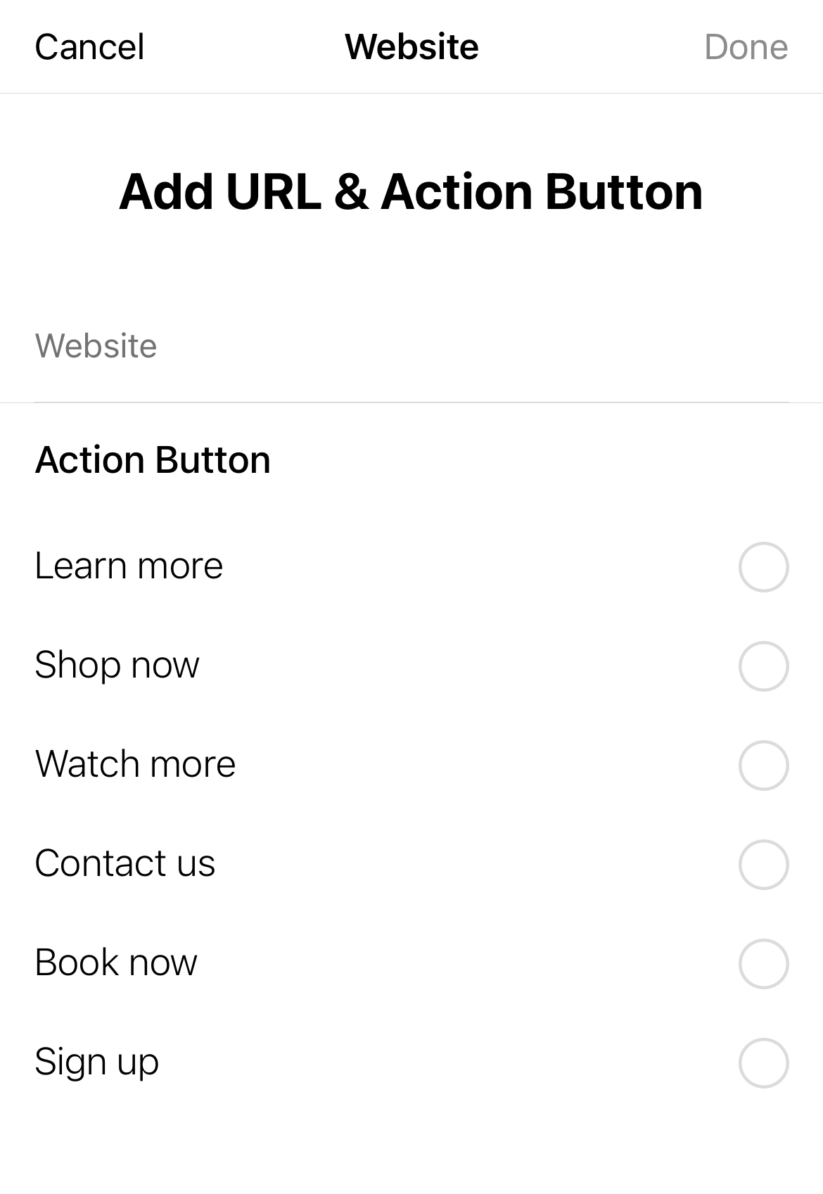
If you are creating a paid ad on Facebook or Instagram, CTAs are pre-selected. If your goal is to direct users to your website, the CTAs you can choose from are: Learn more, Shop now, Watch more, Contact us, Book now, and Sign up.
However, if you are simply posting to direct followers to your website or lead magnet, you can get creative and weave CTAs into your caption. For instance, if you mention at the end of your caption, you might say something link:
Instagram:
- Click the link in bio to claim your free <lead magnet, such as offer, resource guide, etc.> by Wednesday!
- Check out the link in my bio to…
Facebook:
- Click the link below to…
- Check out the link below for…

Website and landing page call to action examples
Generally, a website will have many different CTAs because different sections of your website will highlight different information. This is especially true on different landing pages. Website CTAs might include:
- Shop [now] >
- Learn more >
- Discover more >
- Explore [now] >
- Browse [now] >
- Get started [now] >
- Get gifting >
- Save my [alt: your] spot >
- Add to cart >
- Get my quote >
- Start free trial >
- Schedule a complimentary call >
- Download [now] >
- Continue >
- Meet the founder >
- Book now >

Pop-up call to action examples
Your pop-up is generally where you offer lead magnets, free resources or pieces of content you offer in exchange for website visitors’ email addresses. Or, it might simply be a place for list building. Here are some examples:
- Subscribe [now] >
- Submit [now] >
- Register [now] >
- Sign up [now] >
- Sign me up >
- Add me to the list >
- Get on the waitlist >
- Get my [alt: your] results >
- Be the first to know >
- Register [now] >
- I want in >
- I’m in >
- Join the club >
- Claim my [alt: your] offer >
- Reserve my [alt: your] spot >
Email CTA examples
Depending on the content of your newsletter, many of the above CTAs can be used in newsletters as well. That said, if you have a regular newsletter schedule (and you should!), you won’t always need your CTAs to be part of a funnel or sales strategy. Instead, you’ll want to come up with creative ways to keep your audience engaged.
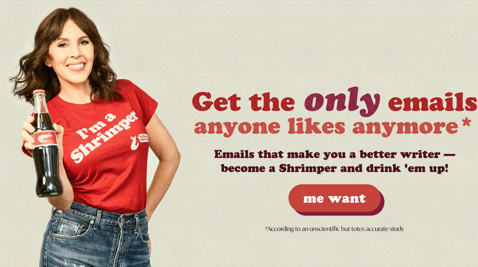
“Even when you’re not writing to sell or promoting anything, give your readers something to do,” explains Laura Belgray, copywriter and founder of Talking Shrimp. “People love to be helpful, and they love to engage. The more they interact with you and your emails, the stronger a connection they’ll feel.” She suggests CTAs such as:
- Check out this podcast I’m loving.
- Are we connected on Instagram? Come find me there.
- Hit reply and tell me ____.
- What’s your biggest struggle when it comes to ____?
- Whenever you’re ready, here are 3 ways I can help you.
- Got questions about this? It’s our specialty. Hit reply and ask away.
FAQs
What is an example of call to action?
The CTA meaning is call to action, and it’s “a hyperlink that moves your visitor through your sales process,” according to Bryan Eisenberg and Jeffrey Eisenberg, authors of Call to Action: Secret Formulas to Improve Online Results (2006). A CTA is generally a button or link that motivates someone to take action during a marketing campaign. Call to action buttons can be found on websites or landing pages, newsletters or email marketing, social media posts, and more. Some of the most common call to actions include “shop now,” “add to cart,” “learn more,” “sign up,” etc.
What 3 elements should be in CTA?
The three essential ingredients for an effective CTA are: value proposition, urgency, and clarity. Another way to look at these three elements is what, when, and how:
- (WHAT) Value proposition: what are you offering, and does your audience care about it?
- (WHEN) Urgency: why should they click on it now (rather than later, when they are likely to forget about it)?
- (HOW) Clarity: how is this offer delivered? What exactly will they get when they click on CTA?
Join more than 150,000 creators who use Teachable to make a real impact and earn a real income.


.png)
.png)
