When we’re talking online courses, your landing page is huge. But one over-arching landing page element that might go overlooked (but really shouldn’t) is your unique selling proposition (USP). We’ll talk about what it is, why you need it, and how to craft it below.
What is a unique selling proposition?
First off, your USP is how you stand out from your competitors. It answer why your audience should sign up/enroll/buy from you and not someone else. Ultimately, it conveys your competitive advantage. The USP is not found on one single spot on your page, but rather it is composed of your copy elements, think headline, subhead, benefits and reinforcing and closing statements, plus support with social proof. Check out some Teachable school examples.
To craft your USP, there are a few things you need to do first:
- Step 1: Know your audience
- Step 2: Research your competition and differentiate yourself from them
We’re going forward with one assumption: you’ve done the research and you know who your audience is, where they hang out, what their goals/hopes/desires are and most importantly, what their problems are—aka that you have the answers to Step 1. If you don’t, check out this post on using your audience’s pain points to come up with an online course idea. On to Step 2.
Research your competition and differentiate yourself
What’s your competition’s unique selling proposition on their landing page? In their offer, what are they doing well? What are they doing OK? What are they doing poorly? Take that information into consideration and tailor your messaging to show how you are different from your competition.
And then be different
Cal Newport does a great job of explaining why it’s better to position yourself as different and not the best on Tim Ferriss’ blog. He starts by explaining that the competition to be the best is very high. The differences between the one dubbed the best versus the next best are marginally small, but in the end, the best/most well known will usually be chosen above the rest. This is known as the Superstar Effect.
See it in action
For example, imagine two students with 700s on their SATs and almost identical GPAs. One is ranked first in the class, the other fifth. Using statistics from Dartmouth College, it “showed that the valedictorian has a 75% of acceptance at this Ivy League institution while the near identical fifth-ranked student has only a 25% chance.”
The difference between the two students is small, but when it comes to choosing one, the best (or the superstar) wins, by a long shot in this case. However, Cal points out that there is “a crucial addendum that makes the power of the Superstar Effect available to most people. I call this addendum The Superstar Corollary.”
As an example of The Superstar Corollary, Cal describes Michael Silverman, an average high-school senior who was accepted into Stanford in a year where only 7.2% of applicants got in. Why did Michael stand out? Well, instead of focusing all of his time on being number 1 in a wide genre, Michael earned press coverage, grants and recognition for his work in environmental sustainability. Michael differentiated himself into a small niche where he could easily become the top of his small field.
“…Nothing about Michael’s rise to stardom required a rare natural talent or overwhelming workload. His projects required, on average, less daily time investment than participating in a varsity sport. Yet, he was the best at what he did among all applicants to Stanford, and the resulting Superstar Effect earned him a disproportionate reward.”-Cal Newport
To avoid getting overlooked in a sea of “the bests,” be different by finding a niche in your specific market and excel there. Find your market niche to show your audience how you are different from your competitors and why they should use you instead.
Crafting your unique selling proposition
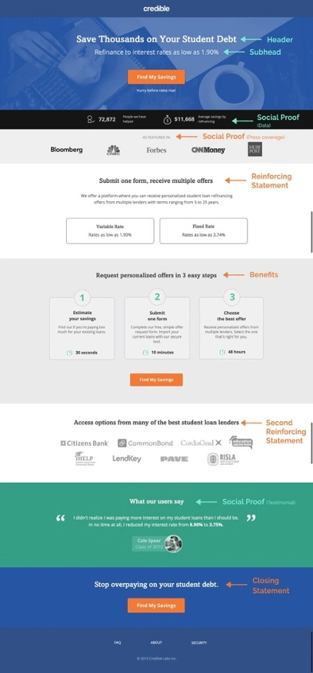
We discussed the importance of compelling copy in landing page, but as a quick reminder, make sure to write your copy in the voice of your audience. Your messaging should add to the conversation your audience is already having about your product and how it solves their problems. Look at social media, discussion boards or emails to find the language your audience is using and replicate it.
Your copy needs to state the value your audience is getting clearly and quickly. Avoid over-hyped words (think of all those weight-loss supplement commercials), superlatives (world-class), and business terms. Your unique selling proposition is expressed through the headline, subhead, benefits, reinforcing and closing statement on your landing page. And of course, social proof is also used to support your USP.
Headline
Your headline is the first stop for your audience to see what your product is and the problem you’re solving. It needs to be short, clear, and easily understood.
“Your headline has one job and one job only. To get your visitors to continue engaging with your message, increase their desire for what you’re offering, and motivate a Call-To-Action click. That’s why when it comes to crafting effective landing page headlines, choose clarity over clever. Clever calls attention to itself at the expense of the message. Clarity smooths the way to conversion.”-Roberta Rosenberg, Copywriter
Roberta offers great advice. Your landing page headline isn’t like a blog post headline. You aren’t trying to write the wittiest title to make your audience laugh. You are trying to get your audience to stay on your page, realize you are better than the competition, and ultimately sign up for your offer.
To see if your headline is clear, follow Peep Laja’s advice: Imagine your landing page is just your headline and call-to-action. Will your headline get your audience to click on your CTA? If you are chatting with a friend, would you use the exact headline to explain your offer? If you answer yes, you’re on the right track. There are tons of different formulas to use to help write a headline.
Test these formulas below with your offer and see how your audience responds.
Copywriter Joanna Wiebe created a list of five headline formulas and examples to try (even huge companies use them) which I’ve copied below for your convenience:
1. “Get the [Rarely Seen Adjective] Power of [What Your Product Does] Without [Pain]

2. [Adjective] & [Adjective] [What You Are / SEO Keyword Phrase] That Will [Highly Desirable Promise of Results]

3. We Promise You This: [Highly Desirable Promise of Results]

4. [Known Competitor] [Does This Undesirable or Unimpressive Thing], and [Your Brand Name] [Does This Highly Desirable or Impressive Thing]

5. The Only [SEO Keyword Phrase] Made Exclusively to [Highly Desirable Outcome or Benefit]”


{{threesteps-component="/blog-shortcodes/blog-popup"}}
These formulas are guidelines for construction, the success of them depends on you and your product.
Joanna also created this headline style list to get increased conversions and showcase your unique selling proposition:
- “Center your headlines
- Make them big and dark, dark grey (or, when on a dark background, white)
- Use “Title Case”, aka Capitalize Each Word
- Don’t use a period at the end as such visual cues present mental stopping points for your visitors
- Break up lengthy headlines with “eye rest” punctuation marks, such as ellipses and em-dashes
- Consider putting quotation marks around the headline as this can draw the eye
- Support each headline with a meaningful subhead written in sentence case, aka capitalize the first word only”
Subhead
Use your subhead to further explain the solution stated in your headline. There are two ways to think about your subhead:
- As a continuation of the headline (like finishing a sentence)
- A secondary place to add persuasive messaging that supports your headline
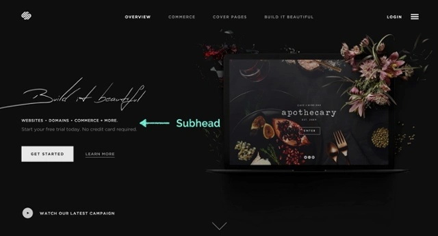
When writing your subhead, follow Neil Patel’s tips: clearly state the benefit and tie it into the headline while keeping it to one sentence. Since readers’ attention spans are shrinking, keep your subheads short and to the point because it’s easy for your audience to scan—but also encourages them to keep reading.
Benefits
By this point, you’ve hooked your audience. Now it’s time to answer their questions on how you will solve their problems. The best way to outline these answers is with a list. It’s an easy way for your audience to get the information quickly and clearly. To start, try answering the question “What do my potential customers need?” with a one sentence answer.
On your page, include three to five points on the biggest problems you are solving for your audience. Rewrite this section as many times as needed to keep your language succinct.
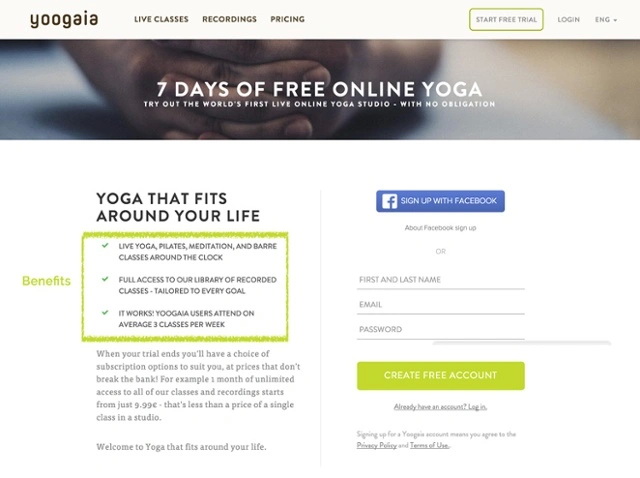
In this section, make sure to focus on the benefits of your offer (how you are solving a problem) and not the features (describing what the product/offer does). This will help drive your unique selling proposition home.
For example:
- Feature: Data Ownership
- Benefit: You own all content and student data from your courses
Including an explanation of the features is a fine line. It helps those in your audience who need more information to make a decision, but it can also make someone’s easy decision more complicated because of an information overload. Since you know your audience best, it’s up to you to find that happy medium.
Reinforcing statement
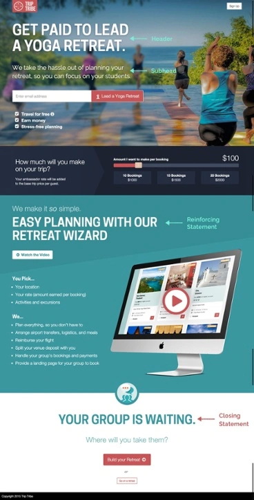
The reinforcing statement is a second headline found midway down a landing page. The goal of it is to continue your USP found in the main headline. This is a great way to showcase a high-value benefit of your product/offer. Use the same design (size, width, color, etc.) as your main headline.
When creating your headlines, Oli Gardner says to think about it as a story written in three pieces: headline, reinforcing statement, and closing statement. You can also think of it this way:
- A statement of uniqueness: Backed up with a supporting statement to establish credibility
- Expand on the experience: And explain how you solve a pain point
- Close with urgency to encourage a call-to-action click
Your main headline explains your product/offer and captures your audience’s attention. The reinforcing statement targets a benefit of your product/offer. While the closing statement is there to get your audience to convert.
Closing statement
This is your last chance to reinforce your unique selling proposition. It’s usually found at the end of a longer landing page and reflects a similar message to your headline. Once again, this should look like the other headlines on your page. Couple this statement with another CTA button to increase conversion opportunities. If your landing page has all of the information above the fold, this statement isn’t needed because your headline is still visible.
Social proof
Technically, this isn’t an element of the USP, but it’s a huge supporting factor. Social proof plays to the emotional data of your audience to support their logical decision to act on the offer. According to Wishpond, “63% of consumers indicate they are more likely to purchase from a site if it has product ratings and reviews.”
When you think about it, that’s a pretty significant percentage of your audience looking for social verification about your product. There are four easy ways to add social proof to your landing page through:
- Testimonials/reviews
- Data
- Press coverage/awards
- Trust seals
Since a landing page is designed with a single objective for a specific audience, find social examples that will directly relate to the audience you’re targeting while being authentic and not spammy. We break each of these examples up below.
1. Testimonials and reviews
Customer testimonials or reviews are a great way to share those quotes from your audience saying how and why your product is valuable. Include their name, website, company, job title and a picture to bolster credibility. Because of the Superstar Effect mentioned earlier, your audience will be more likely to use your product or sign up for your offer if someone with high influence (a “superstar”) has too.
Place these under the benefits statement and near your CTA.

2. Data
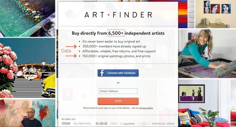
Use numbers to impress your audience and show how popular you are. Show off sign-ups per week, number app downloads, total subscribers to your newsletter or blog, number of students enrolled in your online school, etc. Data can be used in your headline, near your CTAs or in your reinforcing or closing statements.
3. Press coverage or awards
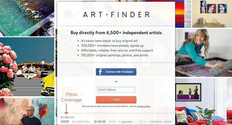
Show off the publications or websites you’ve been featured in by displaying their logos on your landing page. Including highly reputable organizations on your landing page boosts your credibility (just like including a testimonial from celebrity influencers). If large, trusted publications recommend you, then it convinces the masses to trust you too.
Put these logos just above the fold or above the footer at the bottom of the page.
4. Trust seals
Trust seals are great to include if you collect and store your audience’s personal data. These types of symbols reassure your audiences that their information is safe and secure.
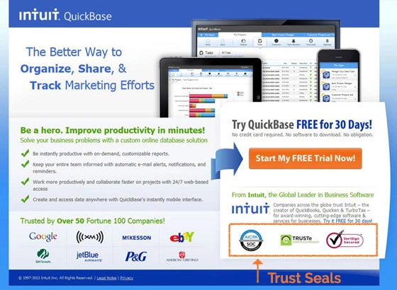
Trust seals are not always necessary. Consider the type of landing page you’re creating and the data you are asking for. Are you creating a landing page to get your audience to enter their email to download a presentation template? You probably don’t need a trust symbol. If you have a large e-commerce site and are collecting credit card information, then maybe a seal might be helpful for your audience. When in doubt, A/B test it!
With these six elements, you’re now ready to start building your unique value proposition for your landing page or website.
Join more than 150,000 creators who use Teachable to make a real impact and earn a real income.


.png)

.png)
.png)
