Thank you! Your submission has been received!
Oops! Something went wrong while submitting the form.
MENU

You know that your course deserves a lot of time and energy. But, there’s another feature of your online business that deserves just as much consideration—your course sales page. Your sales page is your best asset for proving your course’s value and cluing your audience in to the transformation they can expect to experience as your student. We’re breaking down exactly why a powerful sales page matters.
When presented with two similar products consumers will always search for clues that one is more closely aligned to their needs and values than the other. You could have the absolute best resource for your niche, but if you’re not making that clear on your sales page, it’ll be hard to convince people to buy.
To create a powerful sales page for your course, think about two things:
Persuasive, authoritative copy builds trust with your audience and gives them points to relate to you on. But good copy alone won’t make a sale. You also have to make sure you structure your powerful sales page in a logical way that makes it seamless and easy for people to purchase.
If sales copy intimidates you, you’re not alone. Even skilled bloggers and content marketers make the mistake of writing sales copy as they would any other copy. But, your sales copy must be distinct because unlike a blog post, the end goal on a sales page is a purchase.
Great sales copy conveys at least two things: the value of your product and the urgency to enroll now.
You can think of writing sales copy as a step-by-step process. When executed correctly, sales copy can result in increased sales and more income for you. Here’s how to get started:
Your course isn’t a perfect one-size-fits-all solution for everyone. You shouldn’t advertise it as such. Before you write a line of copy, figure out exactly who your target audience is. Consider these factors:
As you answer these questions, a persona will start to emerge. The more specific you can get, the better (imagine one person, maybe someone you know).
If you know that your target persona is a 55-year-old male who is a first-time entrepreneur honing his business idea, it’s much easier to develop copy that’s persuasive. You’ll be able to talk about technology and business in a way that makes the most sense to him, which will make it a no-brainer for him to take your course. After all, you understand him, and he can trust you.
Take a look at how Melyssa Griffin clearly describes who her online course is best fit for and who isn’t right for taking Pinfinite Growth.
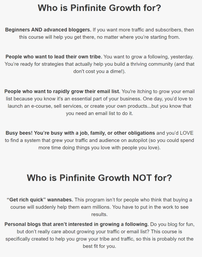
Off the bat she says that this course is perfect for bloggers new and old. She states strategies in her online course will help anyone looking to grow their traffic and email list. Furthermore, the course is perfect for busy folk who are looking to run their Pinterest on autopilot without having to devote a ton of time or energy to the program.
By making it clear who you’re targeting with your course you accomplish two things:
A powerful sales page should be easily scannable and digestible. Your audience is likely to first scan a sales page before diving in. Divide your sales page into very clear sections set apart by images, graphs, and color blocking. You can also use plenty of bold text and colorful text to make certain points and statements stand out.
Your audience members should be able to take a very quick, 15-second look at your sales page as a whole and already have an idea of whether or not your course is going to be a fit for them. Based on an initial scan, your audience will decide whether they should stick around.
This one step will encourage significantly more people to stick around and take the time to read your page, giving you more opportunity to win your audience over via your superior sales copy.
At Teachable, we make dividing up your sales page simple. Our default template breaks up the sections for you. And, our text editor makes adding heading and different sized text simple.

As an entrepreneur your story matters. And, telling a story on your sales page can really help your audience connect with you and your product. By painting a vivid picture of who can benefit from your product and the problems you’re going to solve, you can help people connect with your product. Start by telling your own story or sharing a case study featuring a friend or client you helped. This increases your authority and adds to a powerful sales page.
Describing a clear pain point that your online course is going to solve. Then explain how your course will help your students overcome that pain point. Doing so is very valuable in creating a powerful sales page.
People naturally try to talk themselves out of making big purchase—whether it’s a new vacuum cleaner or an online course that can transform their life or business.
You need to nip that tendency in the bud.
Address any rational concerns someone might have when it comes to buying your course. Frame your online course as the best possible solution for the problems that your audience is having.
A call to action is exactly what it sounds like: text or an image that’s calling out to your reader to take an action. And, it can be as simple as “Enroll now!” or a little punchier, “Join the fun and buy today!”
It’s easy to worry about being salesy and opt for softer calls to action, like “Learn More.” But if your copy is doing its job, your future students are looking for a clear button that tells them exactly where to purchase. So, be upfront and ask people to purchase or sign up for your course, because that’s why you brought them to your sales page in the first place (and that’s why they’re there).
Benefit-driven language presents your course to your audience in a way that appeals to them and their needs. Instead of saying, “I’m giving you five hours worth of content that I spent two months creating!” You can say “After taking this course you’ll be able X which will result in Y and Z.”
Make sure that your sales copy is less about you and more about your audience and your online course. Here is an example of benefit driven language from Reach Your Readers by Creativindie.
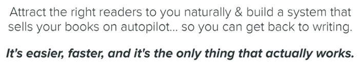
Benefit-driven language helps people visualize what the outcome of the course will be, and they’re going to be more excited to buy.
Here are five great online voices to subscribe to for tips:
Now, let’s take a look at the actual structure to use for your sales page.
When it comes to the design of a powerful sales page, there is a simple formula you can follow for maximum results.
Luckily, Teachable’s sales page editor makes following this formula to create a beautiful sales page that converts easy and intuitive.
The headline is your first place to really wow your potential customers and get them intrigued. In this example from “Creating a Profitable Podcast” you can see they use:
They give their most eager students a chance to enroll right on top of the page. Your Teachable school comes with a hero CTA right out of the box.
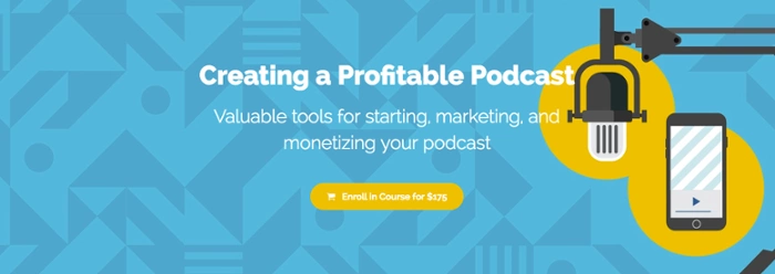
Now, you don’t have to use bright colors if they aren’t part of your brand. But, do consider color theory and how your colors are playing together. Make sure that your text isn’t hard to reach or blending into the background. The color wheel from Canva is a great resource.
As for using descriptive language, think of words like: ‘profitable’, ‘valuable’, and ‘monetizing’. These are powerful words because they are very clear and get at one of the primary things that drives people’s behavior—money. It’s more valuable to teach someone how to do something and be successful with it than just teach them how to do something.
Now that you have your audience’s attention, hook them in with a powerful course description. Create a description that will appeal to your ideal audience and get them excited about the prospect of taking your online course.
One thing to make sure you’re establishing when creating a powerful sales page: your transformation. What exactly will your audience get from taking your online course? Make it very clear what you’re setting out to teach.
Here’s a great example of a course description from Contino Workshop.
“Join me, alphastructaesthetitologist* Jon Contino, as I walk you through every step it takes to become a master lettering artist! From the history of written language all the way to customizing letters for logo design, this class will provide you with the tools it takes to make, break and rebuild letterforms into strong, interesting and unique works of art.
In this super-efficient crash course, I will share vital and core knowledge of typography history, the tools it takes to design letters, explain in detail how to master fundamental lettering and, of course, how to create your own style.
With 37 lecture and demonstration videos, a PDF workbook, and a detailed list of resources and where to get them, this class will benefit everyone from the first-time lettering artist to the seasoned pro!“
A case study is a narrative account of someone’s experience after they’ve gone through your curriculum and benefited from it. For example, if you’re teaching how to negotiate for a raise in your corporate job, take a look at someone who took your course and successfully negotiated her biggest raise to date.
A testimonial is someone singing your or your course’s praise. Your call to action is simply the place where you’re going to urge your audience to take the plunge and purchase your online course. It could appear as a button or a hyperlink depending on the design of your site.
Introduce yourself! People are going to be curious about who you are and what your credentials may be.
Depending on the nature of your online course, you might want to include the following:
Here’s a great instructor bio from Coding Explained:

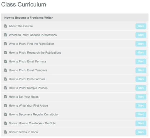
If people are still on the edge of deciding whether or not to purchase, giving them a sneak peek of your curriculum can help them get excited. Here’s an example of how that might look from Pitch Perfect by Elana Gross.
Again, highlight how incredible your course is by sharing someone else’s experiences with it. Interspersing your sales page with endorsement from others is a subtle way to make major progress on convincing someone to buy your course.
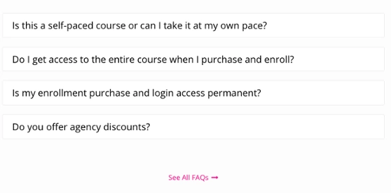
The more thorough your FAQ section is, the less time you’ll spend answering the same question over and over again via email. Your FAQ can calm your audience’s fears over things like refund policies. And, it also help them understand the nature of your online course a little bit better.
Here is a great example of an FAQ Section from Content Strategist Certification Course.
Here’s your final CTA. Hopefully by now your audience has made up their mind to purchase. And your last CTA is going to make it easy. Having multiple opportunities to buy on your page helps prevents your future customers from hunting for your “buy” button.
When you’re designing your sales page, it’s easy to go overboard. But a few key design tips can prevent that: