Creating your online course is only half of the battle, you also need to entice people to buy. You can do this through a clever marketing strategy, a series of webinars, or targeted emails to your audience. No matter what method you choose, the one thing all marketing efforts have in common is that they drive traffic to your sales pages.
Your Teachable sales page is so important in your online business because it’s the final thing standing between your potential customers and your online course. Your sales page can really make or break sales for you, so it’s something you’re going to want to get right.
Elements of a beautiful sales page
Teachable makes creating your sales page easy, our plug-and-chug editor helps you create a professional page that’s proven to convert no matter your experience level. And while our sales page editor is fairly templatized, there is so much you can customize to create the sales page of your dreams.
From colors, to graphics, to text type, and additional elements. Taking the time to give your sales page the TLC it deserves can go a long way in wowing your customers.
This blog post is mostly for inspiration (check out this post for a sales page guide,) but before we dive into looking at the beautiful Teachable sales pages I rounded up, here are a few key takeaways.
When it comes to the design of your sales page, there is a simple formula you can follow for maximum results.
The winning formula
- Headline/hero: This is a single sentence or phrase where you describe what your course is.
- Course description: Here you can spend a few paragraphs going into further detail on what your course will cover and who it is for.
- Case study/testimonial: Testimonials help prove that other people like your online course and help build your credibility.
- Call to action button: Calls to Action are simply direct text urging your audience to purchase. Big buttons that say something like “buy now” are an example of a CTA.
- Instructor bio: People want to feel connected to their instructor, make sure to fill out your bio and let your personality shine.
- Case study/testimonial: Another case study or testimonial can really give people that final nudge they need.
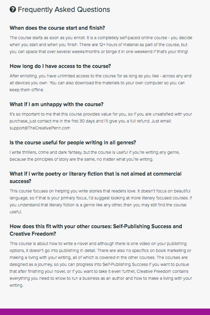
- FAQs: People are going to have questions, and it’s in your best interest to answer them all in one place rather than spending an hour a day responding to emails answering questions.
- Call to action button: This CTA acts as that final push convincing people to purchase.
Luckily, Teachable’s sales page editor makes following this formula to create a beautiful sales page that converts easy and intuitive. The design side of creating a beautiful sales page is another topic entirely, and one that is easier to see than read about.
Take a look at these and begin to decide what you like and what you want your sales page to look like. Of course, these should serve as inspiration only. Make sure your sales page is true to your own brand and tastes.
Get inspired
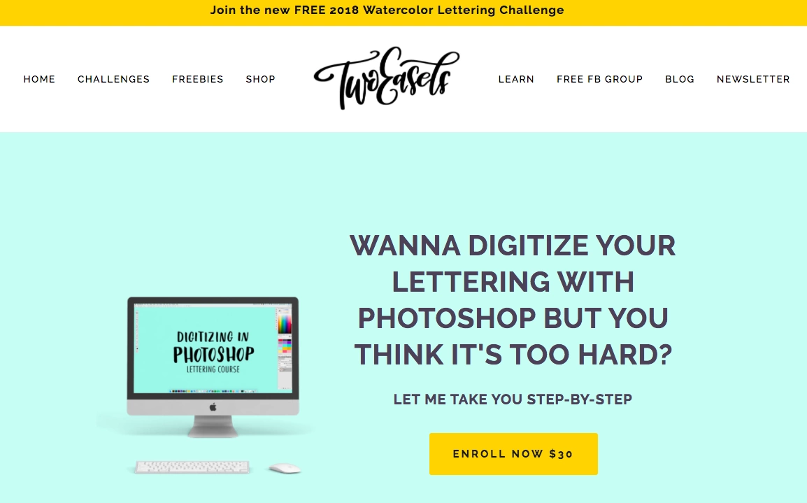
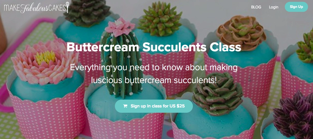
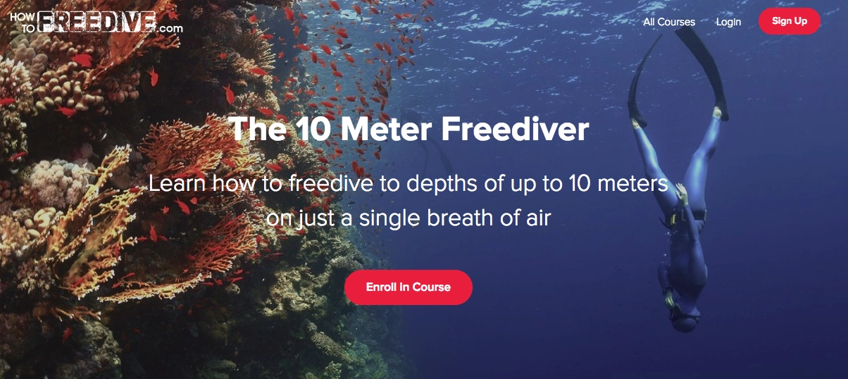
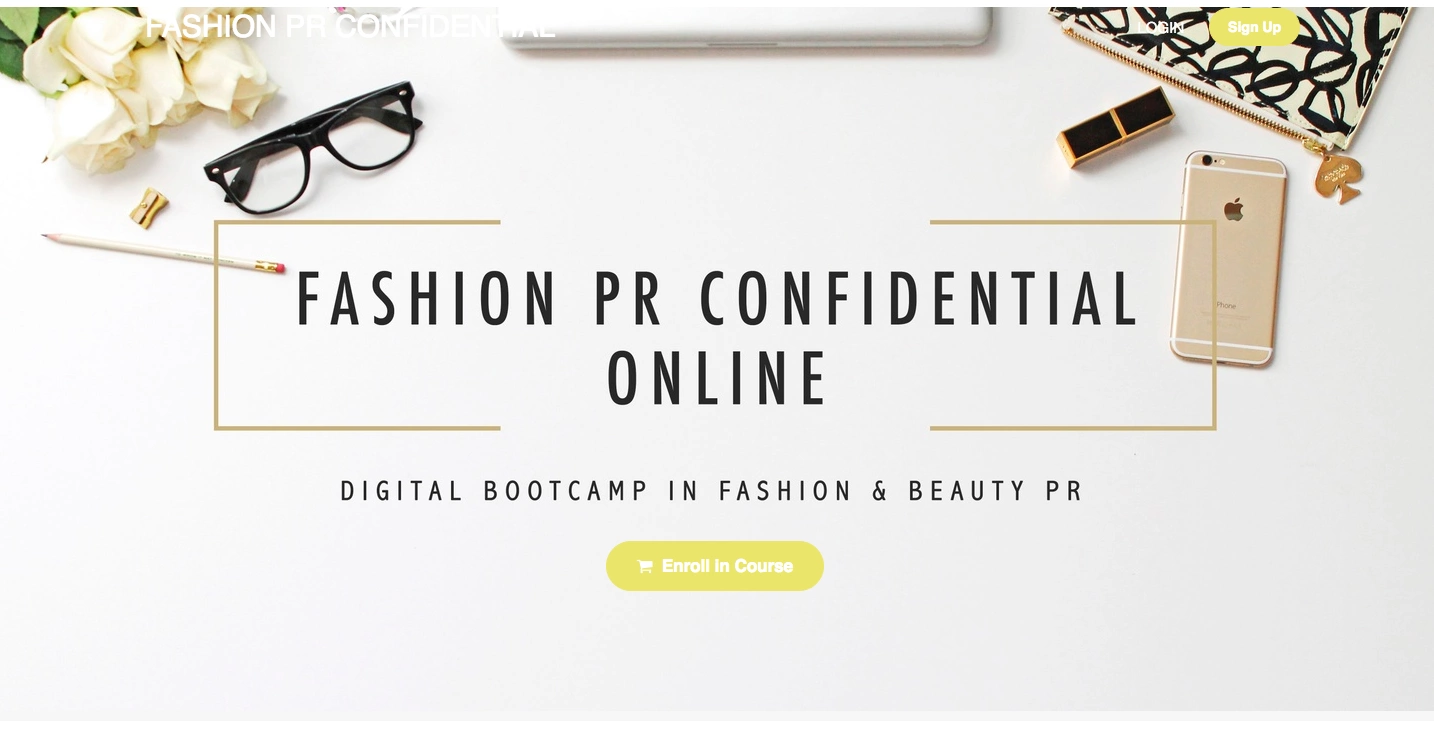
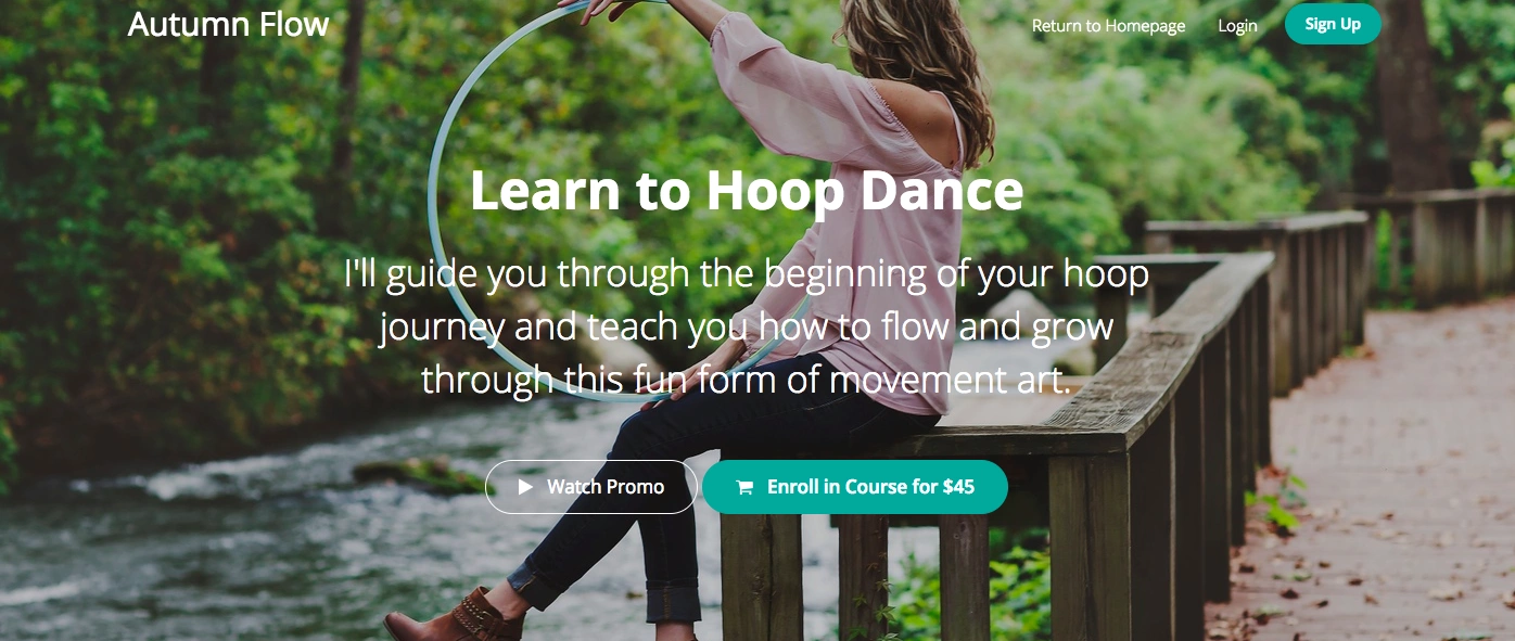
Great headline and heroes
These schools use color, examples of what they’re teaching, and descriptive language to catch their audience’s attention and encourage them to learn more about their offer.
Two Easels
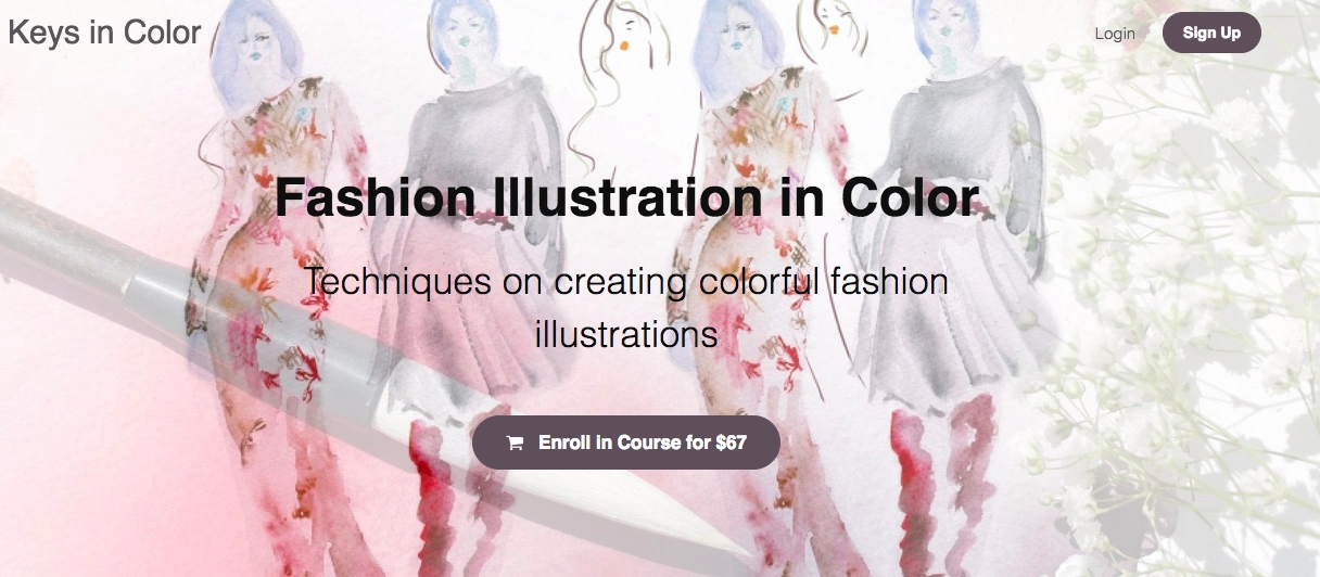
Buttercream Succulents by Make Fabulous Cakes
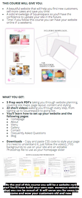
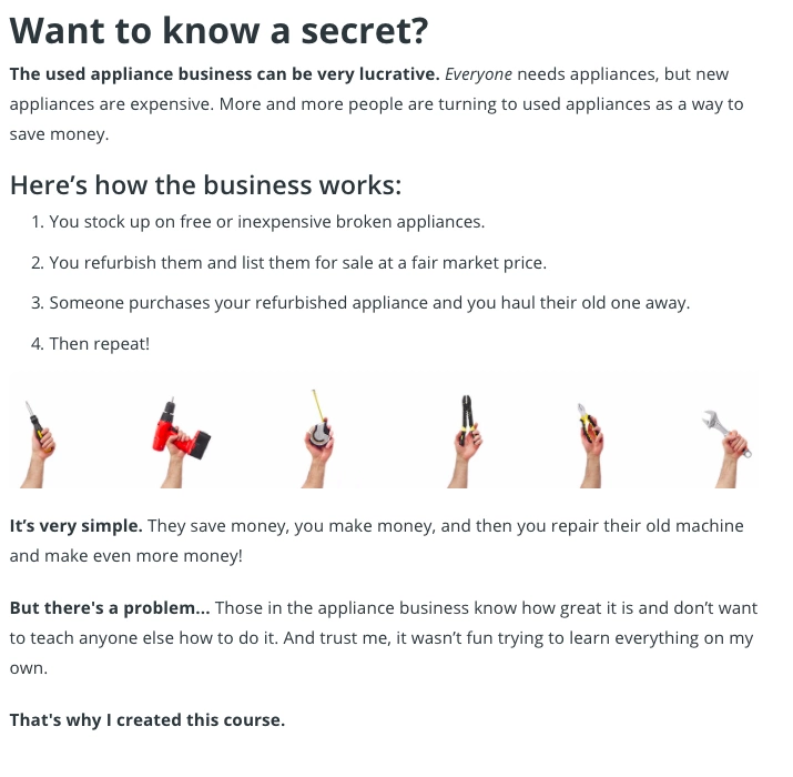
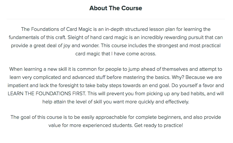
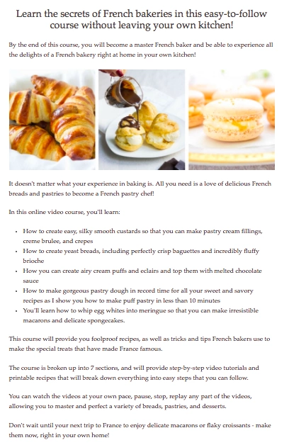
Great course descriptions
These instructors do a great job vividly describing what they’re offering their students and what customers will walk away with after purchasing the online course.
Great Case studies and testimonials
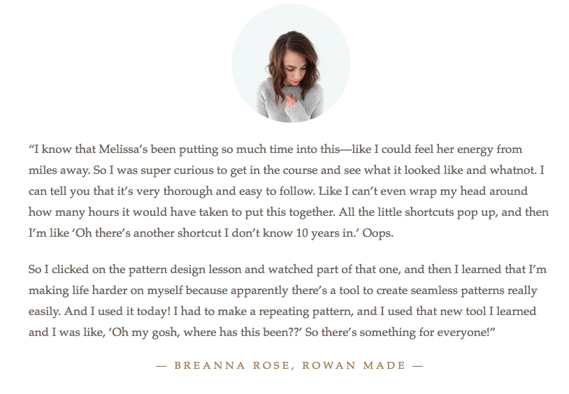
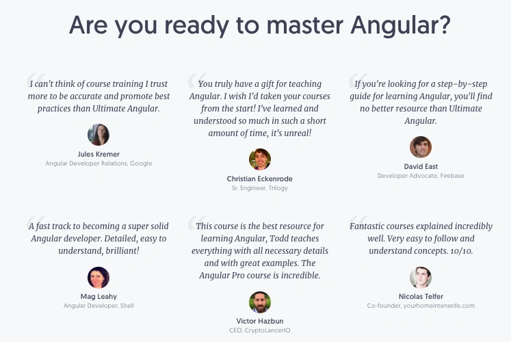
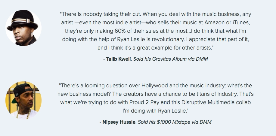
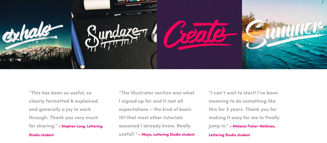
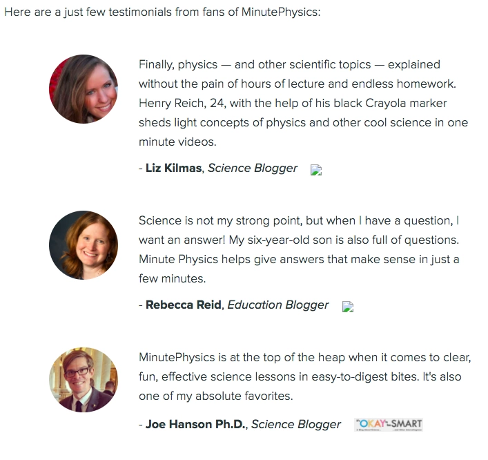
These course creators do a great job using case studies to highlight their students’ successes, share where they’ve been featured, and build trust around their online courses.
Melissa Yeager, Illustrator Essentials
Lettering Studio

Great call to actions
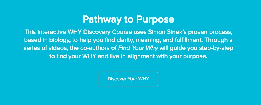
These course creators use descriptive language beyond “sign up today” or “buy this course” to entice their customers to click.


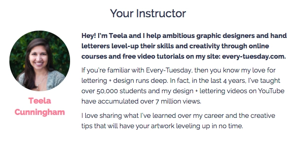
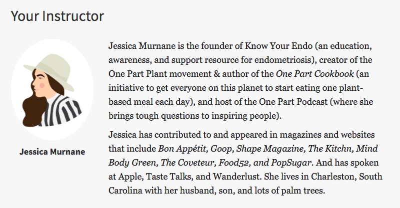
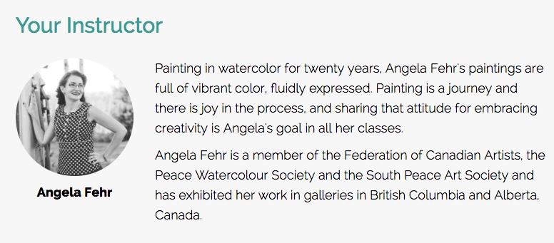
Great instructor bios
Potential students want to know who they’re buying from, and these instructors do a great job introducing themselves and sharing why they’re an authority in their niche.
Every Tuesday Brush Lettering with Watercolor
Great FAQs
These instructors use FAQs to save time down the road and avoid answering the same questions via email over and over again.

Join more than 150,000 creators who use Teachable to make a real impact and earn a real income.


.png)

.png)
%20(1).png)

