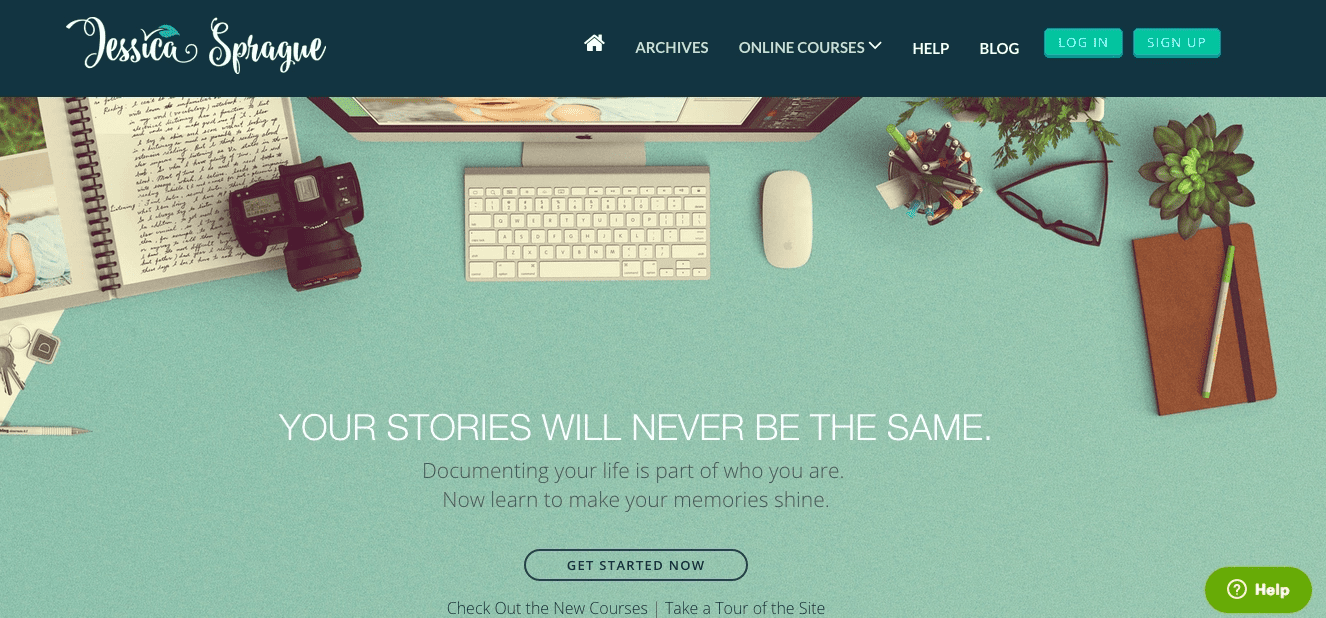
In this article, Jessica Sprague tells us why a gorgeous homepage is important and how she designed hers to earn credibility from 80K online students. One of the most frequently asked questions in our community is, “How do I get Jessica Sprague’s homepage?”

It pays to be a master
To be fair, Jessica is a master of her trade. For someone who fell into scrapbooking, she’s seen considerable success teaching digital tricks to crafters. In 2007, she launched a course called “Up & Running with Photoshop” that crashed her server. She now teaches through Teachable with over 80K students enrolled in her online course that quickly made over 20K in 4 months.
We asked Jessica if she’d join us for a joint-webinar and teach people how she set up and customized her online course. Specifically that gorgeous homepage. We’re not sure if Jessica knew what she was getting into, because after she said yes, we had over 600 people register.
Jessica’s designs are way more than just pretty. That sassy succulent does more than look fresh. It adds to the perceived value of Jessica’s information drawing in students and convincing them to buy her course.
“You know how they say image is everything, I hate that, and don’t think it’s true, EXCEPT for web design, in which, image actually is everything. What I mean is that in order to put across that credibility that we’re looking for, in order to invite people to trust you as their teacher, you have to be able to show them beautiful things. That is the toughest part, but I’m going to help you along the way.” – Jessica Sprague
Here’s the research…
1. Good Design = Credibility
Put simply, good design increases site credibility (and we all know that affects profits!).
The Stanford Credibility Project ran a study with more than 2,500 participants, “Nearly half of all consumers (or 46.1%) in the study assessed the credibility of sites based in part on the appeal of the overall visual design of a site, including layout, typography, font size and color schemes. (…) Beautiful graphic design will not salvage a poorly functioning Web site. Yet, the study shows a clear link between solid design and site credibility.”
2. People Associate Beautiful Web Design With Usability
Yoast nicely summarizes a technical study proving that people perceive a visually appealing website as usable due to the halo effect (you know, that one you learned in Psych 101 where beautiful people are presumed to be nicer, smarter, better whether or not they actually are). As in people, so in websites.
3. First Impressions Are Important
Conversionxl.com makes two gut-wrenching points. First, it only takes .05 seconds for someone to judge your website. Secondly, if they disapprove, they’ll leave immediately and continue to distrust you and your product in the future. It’s like meeting your dream date while wearing crocs. Yikes!
Hard Fact: You’ve done a lot of work to get people to your website, but if it’s poorly designed, it’s wasted effort.
In summary, good website design is pretty freaking high-leverage and important, and unlike my sprinkle doughnut, I’m more than happy to share.

Here is a list of design resources Jessica mentioned in the webinar (in order of mention):
- Teachable Online Course Platform (Our very own technology for hosting your online course.) “Omg, I can create a class in like 15mins…If you’ve ever tried to teach an online class using your own cobbled together server plus content management plus a store… all I can say is that it was a complete nightmare and I had literally given up and stopped teaching for a year,” said Jessica.
{{homepageguide-component="/blog-shortcodes/blog-popup"}}
- Dreamweaver: (An authoring toolset that shows a live side-by-side comparison of HTML and its output.) “This is the one I use in my class and is the one I recommend,” said Jessica.
- Photoshop: (Image editing tool) “If you want to create really cool headers, as far as hero images, or to create really cool thumbnails, you have to have an image editing application,” said Jessica. It’s $10/month, but you can find a demo here.
- Screenflow: (Records screencasts, or video of your computer screen.): Here’s a screenflow tutorial you can use to get started.
- CreativeMarket.com: The kit of images Jessica used to design her hero/header image.
- Free Stock Photos: Ankur mentions “where you can get free high quality images.” Here’s a list of free stock photo sites.
Not mentioned, but helpful
- JessicaSprague.com: We think it’s awesome and wanted to give you a quick link to it.
You’ve probably noticed that Jessica works in a field that values appearance, but web design is equally important if you’re selling music, medical care or another type of online course.
It’s incredibly clear that a beautiful homepage is important no matter your online product
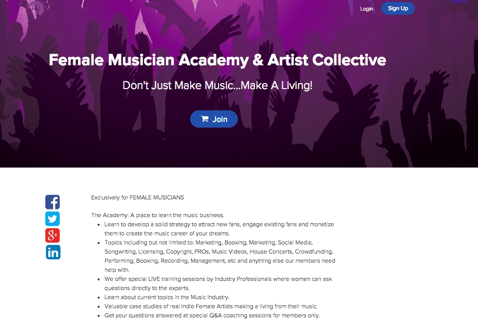
Looking at our own original data, Bree Noble, a Teachable instructor who sold her course Female Musician Academy at $290, was able to presell her course because of its stunning design.
“I was able to pre-sell my online course (Female Musician Academy) to 15 people at $290 ($4,350) without having any content in the school yet. In fact, my new students told me that my Teachable school was so beautiful that they could tell the course was going to be amazing.”

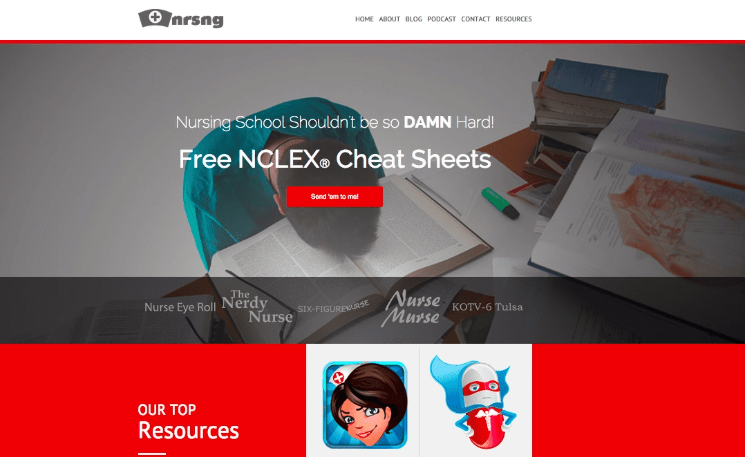
Another instructor, Jon Haws, who made $16,000 launching his course NURSING.com discusses why he values design:
“I’m trying to get everything as clean and crisp as possible and the logos and designs are still changing. With nursing specifically and with YouTube and the way that it is these days. You see that anyone can throw content out. Watching people make videos, well, it’s frustrating because they’re not always giving accurate content. But they’re getting out there and getting in front of people. My goal is to make the audio clean, video clean, logos clean, everything clean, and of course have accurate content, to be more trustworthy.”

Join more than 150,000 creators who use Teachable to make a real impact and earn a real income.


