Many online courses are built on a foundation of slideshow videos with voiceovers because they’re quick to create, easy to follow, and when done correctly, quite beautiful. We’re a big proponent of slide videos here at Teachable, so we wanted to share with you exactly how to create ScreenFlow slide content.
Key concepts
Before beginning, you want to know that there are three common types of video content you can create for your course.
1. The talking head
Talking head videos are recordings of you sitting and talking to your camera. These are great for conveying emotion and best used in introduction videos or videos meant to excite and engage your audience.

2. Screencasts and voice
Screencasts are great for student learning and they’re quick to create. Screencasts make your video easy to follow and are ideal if you’re explaining something complicated or moving at a fast pace.
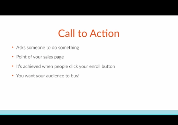
Computer screen and voice: Best for technology tutorials and showing step-by-step instructions for how to do something.

3. ScreenFlows and video
Best used if you don’t want to edit together talking head videos with screencasts and voice. Students engage well with this content.

Our advice
High quality: Only using screencasts can get boring, so edit together talking head videos with screencasts and voice, or change up video types between lessons.
or
Rough: Use Screenflows and video. It 100% works, but don’t try to charge over $200 for a course filmed this way.
Creating Screenflow slide content
As you create slides for your online course, remember the goal to convey valuable information and help your students reach their transformation as quickly as possible. Before creating your slides, you need to make a decision: Do you want to create slides with a voiceover? Or do you want slides with a video of you presenting in the bottom right hand corner?


You can incorporate both into your course. But, be mindful to leave space on your slides for video. Below, see an example of how the designer places an orange box on her slides where the videos appear to remind us not to place any content in this area.
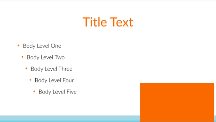
If you’re advanced with videos and editing, you can shoot talking head videos and edit in clips of the slides.
In this next section, we’re sharing tips to design your own Screenflow slide content.
Layout tips
Before you start designing anything, make sure your slides are in the video format you will be shooting in. For example, we shoot in a 16:9 aspect ratio, so in Keynote we design the slides in widescreen format.
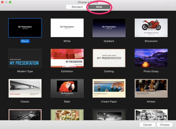
Using slides that are in the same format as your video ensures that no information is cut off and makes editing way easier.
Keep slide text brief
Don’t put paragraphs of information on your slides. It’s too much to take in and your audience may become distracted trying to read what’s on the slides and will stop listening to you. Instead, use bullets or very short sentences. Use multiple slides for a point, if needed.
Color tips
If you already have a brand, use your branded color palette. But, if you don’t have a brand or color palette already, that’s OK. Picking colors for your slides is an easy place to start. Choose two to three colors to use throughout your slides.
One dark color and one light color is a good place to start. Then choose an accent color for shapes or other design elements, like calling out important points.
As you can see below, the colors in the right hand column look great together. The light blue pops on the charcoal grey background and so does the dark green text on the pale green background.
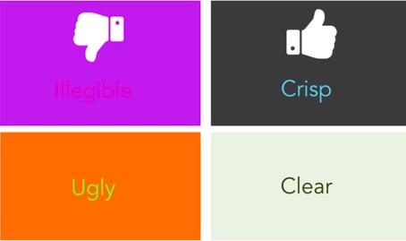
They’re also easy to read, which is definitely another factor when you’re choosing your colors. Keep in mind legibility and how the colors look together.
Three great sites to use:
For text, use one color for the header text or when you want to emphasize an important word. And use another color for the body text.
Typography tips
Choose a serif or sans serif font when creating ScreenFlow slide content. These two fonts are the easiest to read. A serif font has the tails on the edges of the letters, while the sans serif does not.
Avoid using decorative or script fonts for your slides because they’re harder to read, especially when small. They are great to call out an important word or phrase (especially if it’s the only word on the slide). Yes, these fonts add pizzazz to your slides, but use them in moderation.
Here is a great list of the most commonly used fonts. If you’re unsure of what to use, pick something from this list.

Now, although this list is great to get started with, you can have a bit more fun with fonts. Start by exploring fontsquirrel.com. It’s filled with commercially free fonts that can really give your content something extra.
One last thing to remember: make sure the fonts you choose are large enough to read. Don’t go for a size 20 font. Start at least with 60 points for the body text and 112 for the headlines.
Image tips
You don’t have to be a pro photographer to use beautiful images within your online course. There are plenty of free stock image websites where you can source visuals from. All of these sites are commercially free, which means that you can use these images for anything without attribution.
Now that you have found your images, it’s time to talk about using text with them.
Tip #1: If the image is a darker image, use white or off-white as your text color. Test out other light colors if white doesn’t look great. Just make sure you can read it.
Tip #2: If the image is light, use dark colored text.
Tip #3: If the photo has a lot of colors or a lot of different stuff going on, add a solid colored shape over it. It can be anything—circle, square, rectangle, maybe even a star, and then add the text over the shape.
Tip #4: Another way to make text readable on busy photos is to add a solid color rectangle over the image and reduce the opacity. Make a solid colored rectangle the size of the slide, place it over the photo and then reduce the opacity until you reach your desired image to color ratio.
Bonus: This is another way to bring your brand colors into your slides.
Tip #5: You can also reverse that process. Instead of putting a color on top of the image, just reduce the opacity of the image itself so you can see it faintly in the background.
Screenflow tutorial: recording content
Once your slides are designed and you’re ready to record course content, it’s time to play with technology. We recommend you use ScreenFlow for Mac or Camtasia for PC. ScreenFlow is what we use in all of our courses and that’s what I’m going to demo.
How to use ScreenFlow to record video content
Screencast and voice over content
1. Get setup. You can read our DIY Studio Guide, but remember to:
- Have your computer charged and open
- If you’re using a microphone have it on and set the right distance from your mouth
- Make sure there’s not background noise or white noise like the AC audible
- Check for echo, if you’re room has an echo grab some pillows, sweaters, blankets to absorb the noise
- Remember, it doesn’t have to be fancy.
Here’s a perfectly good setup:

2. Open your deck to the very beginning of the presentation (or don’t if you’re not going through slides)
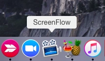
3. Click on the screen flow icon and click though File > New
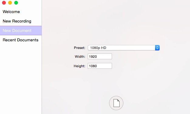
4. Adjust the recording size here
5. Check your recording options here
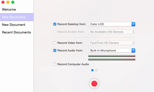
6. Hit the red button (it counts down from 5, but you can adjust this in “Preferences”

7. As the time is counting down, hit “start” on your presentation
8. Start speaking just after the recording starts and flip through your slides as you speak over them
9. Quickly end the presentation using the apple+shift+2 command when you’re done.
10. If you plan to edit off the ending, make a loud noise and then hit the command.
For a screencast and video
The only difference is that your computer will be recording video not just voice. You’ll want to make sure
- Make sure your camera or laptop is eye level
- Don’t tilt the laptop screen, keep it vertical
- Use a black or white background
- Make sure your outfit is a solid color and doesn’t match your background
- Keep appearance in mind—whatever makes you feel good!
While you’re recording, make sure to look at the camera. You can insert presenter notes into you slides if you’ve written a script or download a teleprompter app on a tablet and use this to assist you. Or, you can simply rehearse your script before recording.
It’s a best practice to keep your course lessons short. This has the added benefit of making them easy to remember in chunks. If you’re comfortable, memorize what you want to say for one lesson and record it in one take. You can then review the script and content for a second lesson and record it when you’re comfortable.
Talking head videos
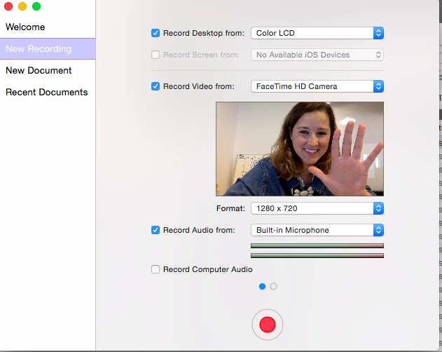
As mentioned, this post is focused on creating slide content, but you can use ScreenFlow to create quick low-budget talking head videos. Simply follow the same steps below, but instead of recording what’s on your screen, record with the computer lens, by clicking “Record Video Form” and selecting your camera.
Editing your video content
Whatever type of content you’ve created, ScreenFlow is an amazingly simple tool for editing videos.Where editing comes in hand is for large chunks that you redo in the same take. With ScreenFlow, cutting off the beginning and endings of videos is super simple and fast. Cut out any big mistakes, but don’t worry about how many times you said “um,” or stuttered. Additional time can be spent giving bonus worksheets or group coaching, which is more valuable. Students also like people who are relaxed and relatable.
Edit out beginning and end noise
1. Use the scrubber to find the area where you start speaking and look for where the spike indicates audio.
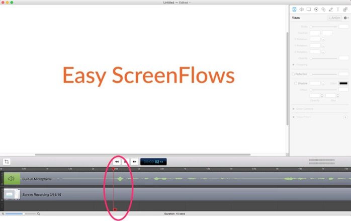
You can magnify the editor to assist.
2. Drag the scrubber to right before the spike, select both the sound and visual, and hit the ‘T’ button on your keyboard.’
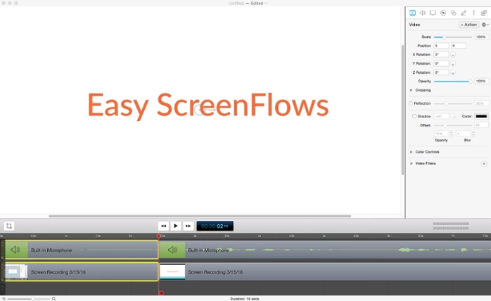
3. Pull the clips apart, hit play to test what you just did. If you want to redo it, apply +Z to undo and retry
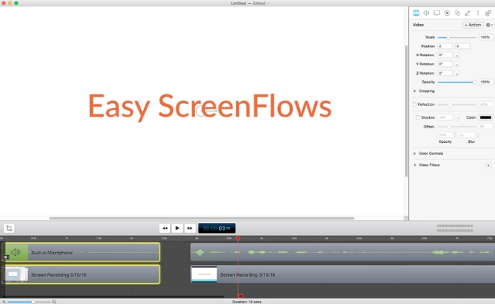
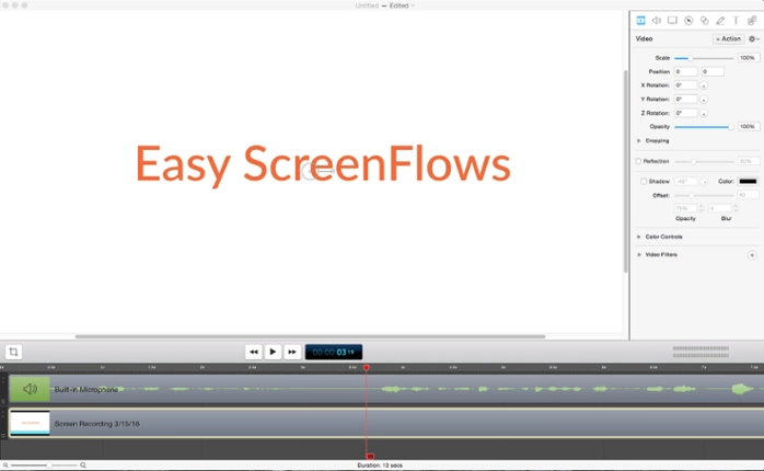
4. Delete the section you don’t want by highlighting the clipped bars and hitting delete and then dragging the bars to the start of the video
Editing out a large mistake in the middle of the video
Let’s assume we hate section 3.5 seconds to 6 seconds.
1. Move your cursor to the start of what you want to cut. Highlight the sound and visual bars.

2. Hit T where the undesired section starts
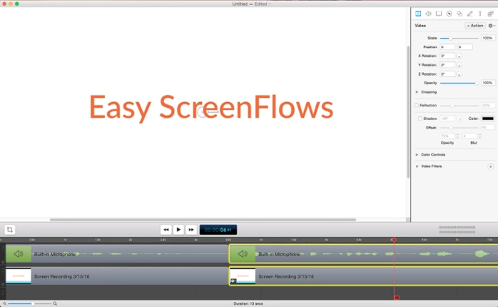
3. Move the cursor to where you want the clip to end, highlight both bars, hit T
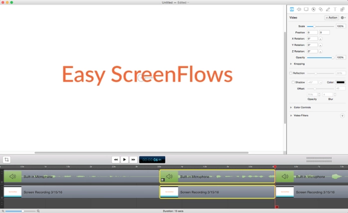
4. Delete the middle section
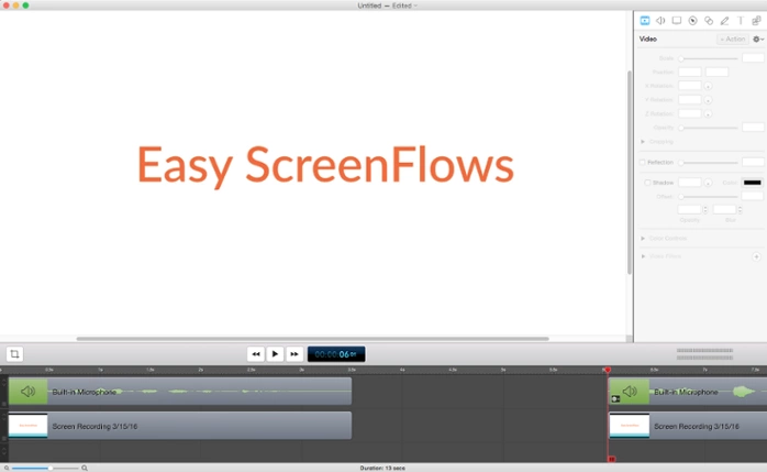
5. Merge the bars by dragging them next to each other

Add transitions to the beginning of your video
- Move the cursor to the start of your clip
- Hit Edit from the top tool bar and select “Add Starting Transition”
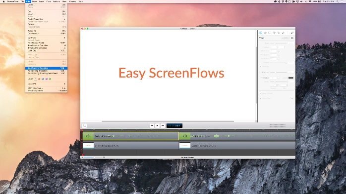
- Drag the cursor to the end of the clips and go to edit, select “Add Ending Transition”
This is super simple stuff and looks professional. No need to pay for an editor when you can do this on your own in a matter of minutes and edit it to exactly what you want.
Exporting your videos to your Teachable course
When you’re happy with your clip, it’s time to export your videos. This is as simple as going to file, export, and selecting your settings. Just make sure you select “Dimensions” > Scale by 100 (Not 50).
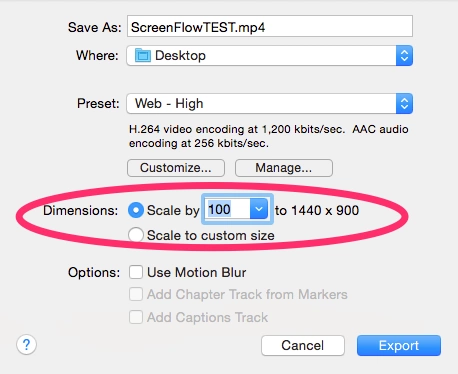
This is extremely important because it affects the quality and resolution of your course videos. If this is small, it doesn’t matter how many precautions you took while filming, you course is going to look gritty, low-budget and bad.
However, what you’ll notice is that the video will be huge. Check out this five-minute video that’s over 57 MB.
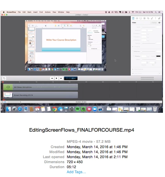
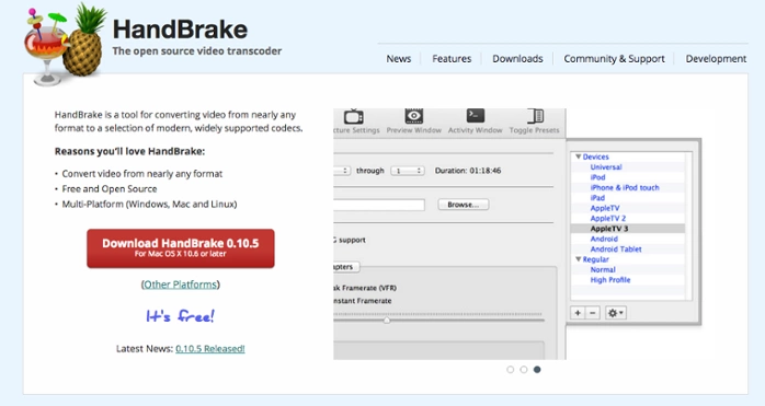
For that, you’ll want to use Handbrake. It’s completely free and can be downloaded here.
1. Drag your video file from your finder to the icon at the bottom of your screen
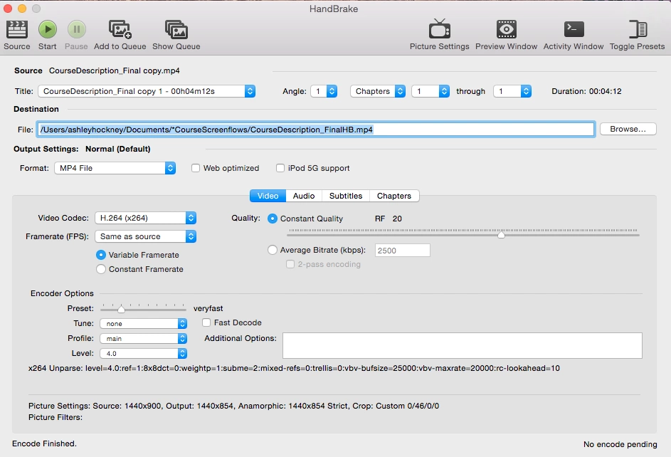
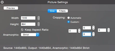
2. Go to picture settings and set anamorphic to strict and select a custom cropping and adjust all numbers to 0.
3. Select browse and set where you’d like the video to be saved and give it a new name if you want
4. Log into your course > curriculum > create a lesson & name it & click on the teal box to “Choose Files”
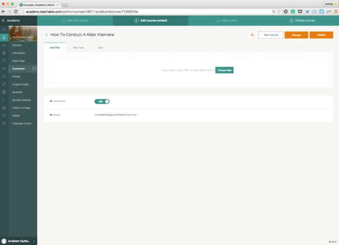
5. Select your file and hit upload
That’s it! You can create a new lesson at the top of the screen or simply use the right arrow key to move to the next lesson from within one to upload multiple videos.
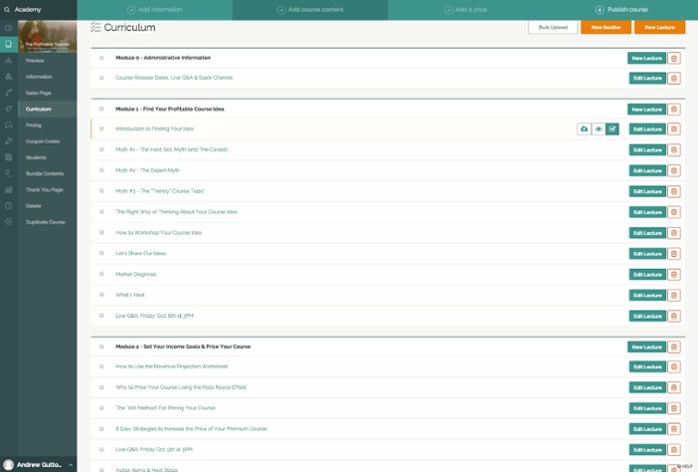
Eventually the inside of your course will start to look like this:
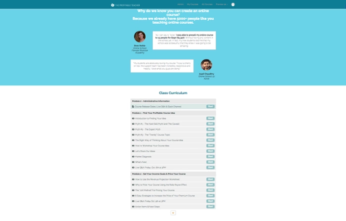
And a preview can be seen from your sales page/landing page:
Now that we’ve covered basic slide design, video recording, and step-by-step editing instructions, you should be feeling more confident in creating ScreenFlow slide content for your online course.
Join more than 150,000 creators who use Teachable to make a real impact and earn a real income.


