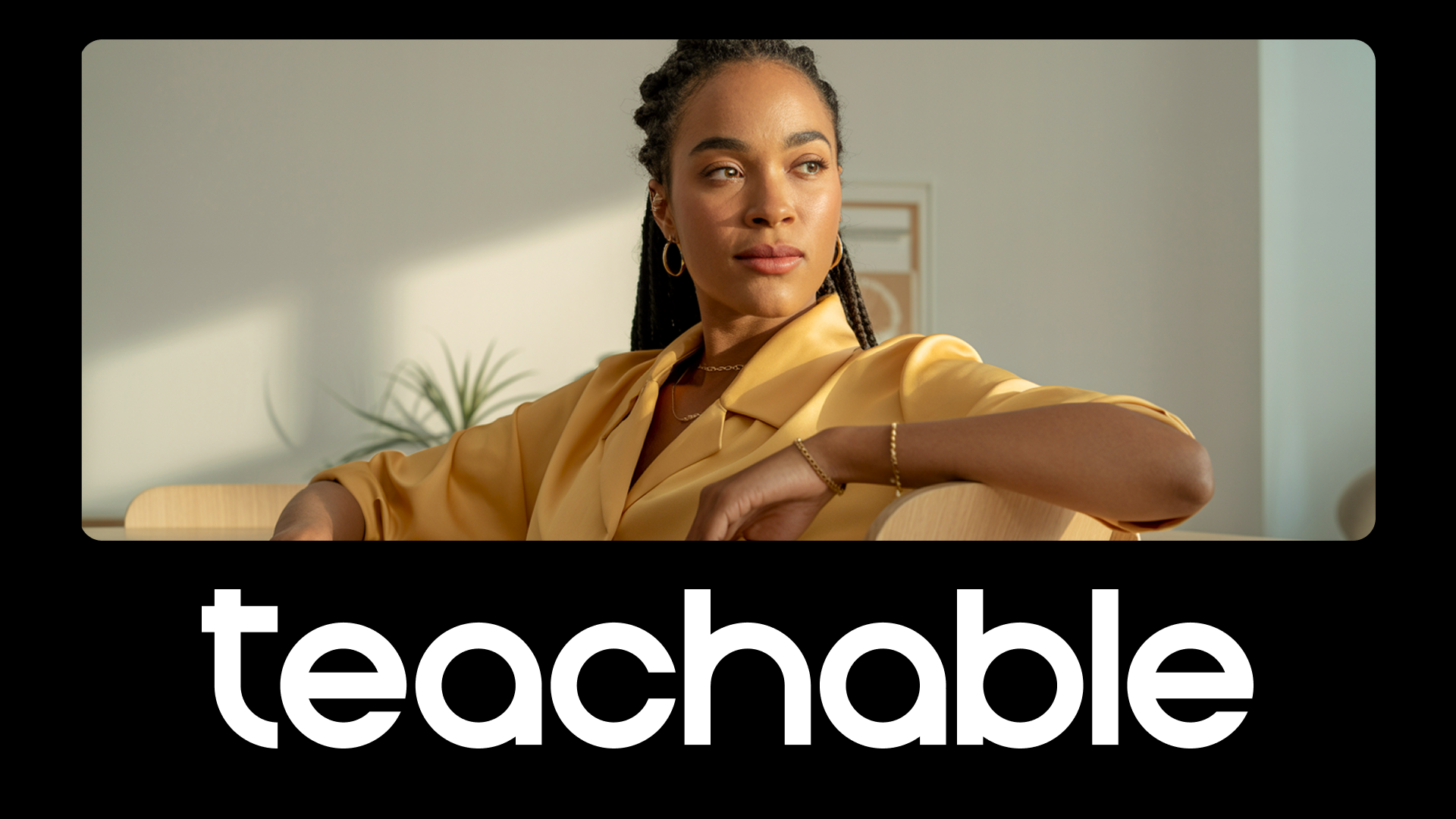
Some people approach getting dressed in the morning with great enthusiasm, ignited by a new opportunity to express themselves through their fashion choices. Others may find the task daunting or even trivial. No matter which side you lean toward, outfit choices are a lot like personal branding aesthetics in business. No matter how high-quality content is, website design leaves a first impression on site visitors (aka potential students and clients). Therefore, it’s important to look presentable to get your messages across. And there are few key elements of good websites you can understand to make that stellar first impression.
Back to basics
Of course, Teachable makes it easy with customizable course and sales pages. Even when customizing, however, you may find yourself wondering: What’s my style? Which colors best represent me? What fonts should I use? Like fashion, branding offers a fun opportunity to experiment. However an endless array of visual elements can be overwhelming and lead to analysis paralysis (and, let’s be real, at a certain point, all shades of light blue and serif fonts all start to look the same). Here are some things to keep in mind when designing or redesigning a landing page or website.
The building blocks
The first step is to get the bones, or structure, of your website nailed down. Ask yourself:
- At a bare minimum, what does my website or landing page need to have?
- From a user or student perspective, what should my website have?
- Dream big: In an ideal world, what would I love for my website to have?
Even though we’re still laying the foundation, the final question is important for being open to creative possibilities, which we’ll tap into a little later on our discussion of the elements for good website design.
The 5W’s
Another suggestion in this structural phase: Take it back to grade school with the 5 Ws (+ 1 H), rearranged in order of importance. You’ll notice all successful websites can answer these questions. In answering these questions, you’ll realize you land upon the key elements that make up good websites.
- What: Can you describe what exactly you are offering? What all is included?
- Why: Why does it matter and why should site visitors care? How will it serve them? (This is arguable the most important out of the six but probably makes the most sense coming after your “what.”)
- Who: Who are you, and why should students trust you?
- When: Is there urgency? Maybe this offering is timely. How long is your course? What’s the time commitment?
- How: What’s the format? How about your teaching style? What can students expect? Be specific.
- Where: Although this isn’t as important in the digital learning space, you might offer some information on creating an ideal space for completing the course. Or, in certain cases, explain if there’s an ideal time for different modules, etc.
You might journal or draw your responses, as though you were creating a landing page blueprint. Hierarchy is important. In today’s world of endless scrolling, we don’t have much time to hold a site visitor’s attention. Be sure the most pertinent information is front and center and communicated clearly. This can be done via visual elements and copy (but more on the latter later).
Branding brainstorm
Next, we can move on to the, well, dreamier part. To successfully brand your business and nail down the elements of good websites that you admire, consider these questions:
- Describe how you want your student/client to feel in three to five words. How might that translate into design and aesthetics? For instance, if you want students to feel confident, you might choose bold colors and empowering language. If you want clients to feel nurtured and supported, you might opt for softer tones and more inviting, inclusive language.
- What are some examples of other websites you love? Consider both within your field and in a completely unrelated field. However, be mindful of not falling into a comparison trap or developing shiny-object syndrome. For instance, if you’re a coach, it’s easy to look at what other coaches are doing and feel like you should be doing the same things. For this exercise, you might find it helpful to look to more aspirational, well-established brands.
- Are there any aspects of your personality you’d like to share? For instance, you may be a culinary expert with an affinity for ’90s sitcoms. While that might not seem like crucial information for converting new customers, it can help to build trust and relatability, which can help you attract your ideal students that get your references and jokes (and will appreciate your teaching style).
While sitting with these questions, it might also be beneficial—and enjoyable—to do some creative visioning. You can certainly create a Pinterest board or digital collage, but going offline and removing yourself from digital media for a while might open new inspirational insights. Take a walk out in nature, then explore some places (for instance, a museum or library, if open) or pages of books and magazines to see if they spark anything. Try collaging, creating a vision board, or making a folder of inspiring images in your phone to reference.
Strike a balance
Ideal website design dances between the two worlds of structure and flexibility. And every successful brand site taps into these creative elements Create consistency with things like default font, color scheme, and clear messaging. But know that you have wiggle room to expand and experiment with new, creative ideas that build off the basics. Ultimately, visual design (of all forms) is an opportunity to express yourself and a vehicle for sharing your messages and gifts with others. In the words of Ram Dass, “You can do it like it’s a great weight, or you can do it like it’s a dance.”
Join more than 150,000 creators who use Teachable to make a real impact and earn a real income.


.png)


